FINALIZATION OPTIMIZATION: PUBLISHING QUEST VR APPS AND GAMES

Written by Nick Foster
We’re closer than ever to Loam Sandbox’s early access release via App Lab. For nearly two years, our team has been working tirelessly to bring the vision of a relaxing virtual reality garden sim game to life. Much of this time was spent designing the game, but a surprising amount went toward optimizing Loam to adhere to App Lab’s standards and requirements. Developing and optimizing a VR game has provided an invaluable opportunity for us to familiarize ourselves with the Quest Virtual Reality Check (VRC) guidelines, an official list of app requirements and recommendations set forth by Oculus (soon to be officially rebranded as Meta). Throughout this blog, we will share the tricks we’ve learned in the hopes that they will help you get your games and apps running on Oculus Quest headsets.

Developers should determine their app’s ideal distribution channel as early as possible.
As you prepare your work for release, the distribution channel you will use to house your game is a significant decision you’ll need to consider as early as possible. Your decision will directly determine how much time and effort you’ll need to spend optimizing your game to run in accordance with various VRCs. Developers tasked with getting their work published and accessible via Quest headsets are presented with the following three different distribution options, with each offering unique advantages and disadvantages for your apps release: the Quest Store, App Lab, and SideQuest.

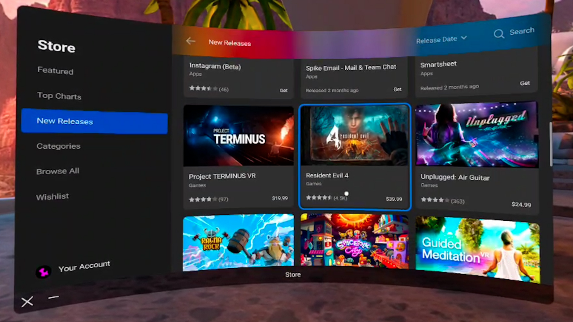
The Quest Store is the only native marketplace for games and apps.
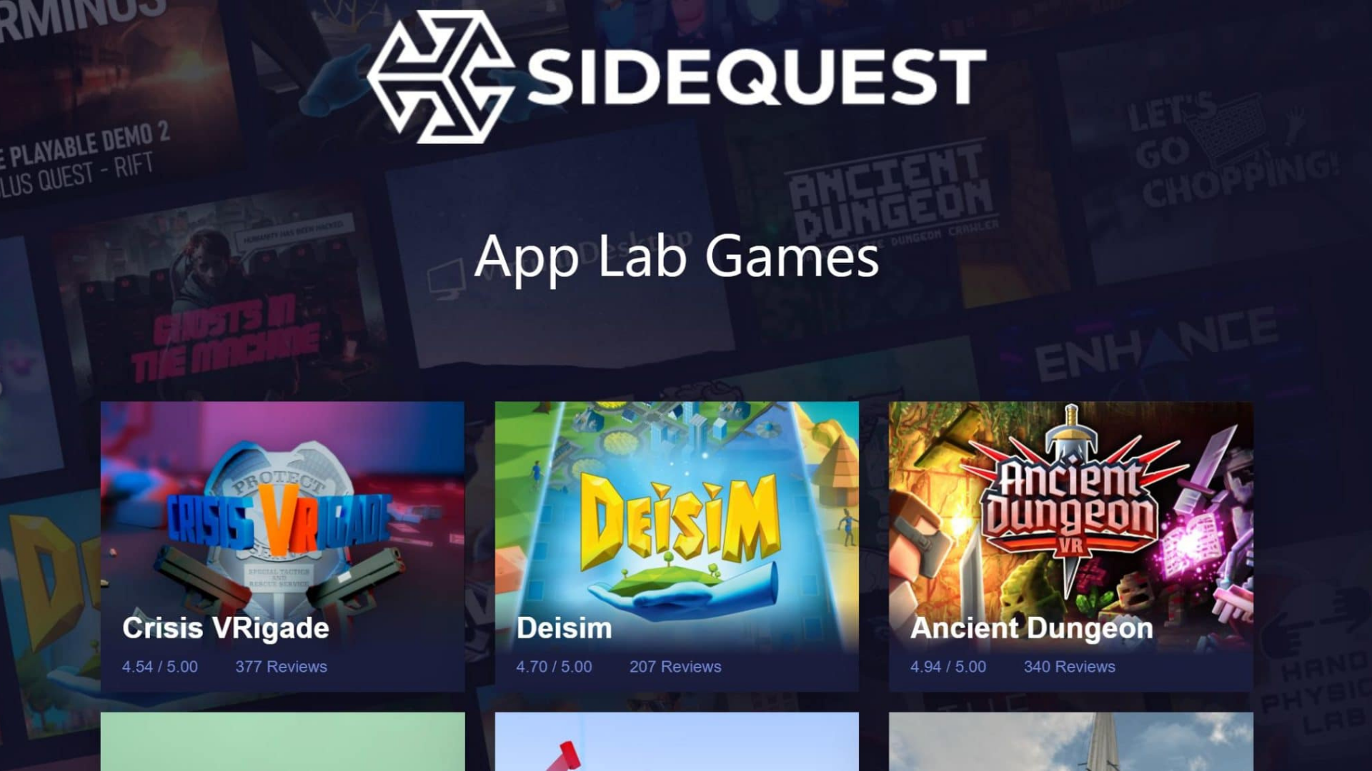
App Lab games can be found in the Quest Store and on SideQuest.
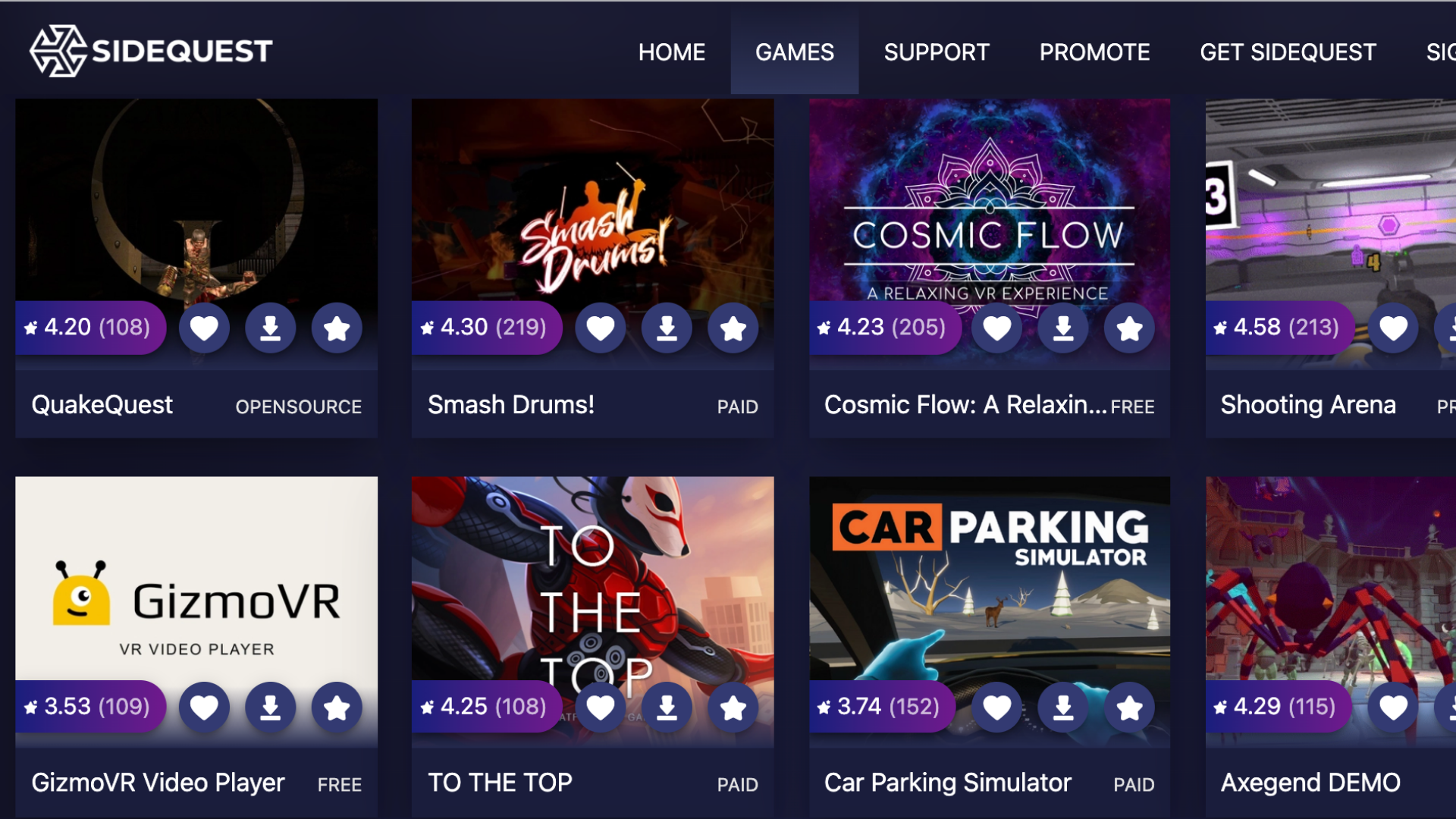
SideQuest enables users to sideload your apps to their headsets.
Please note, there are other distribution avenues for your VR games, but this blog will focus solely on platforms accessible by Oculus Quest headsets. Other platforms will offer different distribution options with different submission processes.
The Quest Store
Of the three available, the Quest Store features the most rigid and demanding set of requirements that your app must meet in order to be published. Despite that, we recommend this route for developers publishing finished games they feel confident in; the Store offers unique and valuable advantages that will help your game find greater success such as excellent accessibility, little competition, and opportunities for organic discovery. These advantages, however, come at the cost of spending a significant amount of time optimizing your game to earn Oculus’ direct approval.
As far as app submissions are concerned, the Quest Store is characterized by its stringency. Apps distributed via the Store must comply with a whole host of requirements set forth by Oculus that ensure everything listed on the Store is of consistently high quality. Although several checks are merely recommendations, these checks span eleven different categories ranging from performance and functionality to security and accessibility.
The Quest Store’s quality-first mentality makes for a strict submission process, but it also reduces the potential competition your app will face should it earn Oculus’ approval. As of writing, there are only about 300 games listed on the Quest Store—less than half the amount available on App Lab, meaning Quest users browsing the Store are far more likely to organically find your app than users browsing App Lab’s library via SideQuest. The Quest Store is deeply integrated within Quest’s user-interface, so this channel also provides the easiest option for users looking to download and play games.
The Store reviews app submissions on a first-come, first-serve basis and has varying review times dependent upon the number of submissions at that time. A solid estimate is four to six weeks, but it’s worth noting there have been instances of developers waiting as long as three months or as little as two weeks.
App Lab
Games and apps published through App Lab are searchable in both the Quest Store and SideQuest. Think of this distribution channel as a happy medium between the Quest Store’s strict approval process and SideQuest’s comparatively lackadaisical approach to reviewing app submissions. That said, App Lab faces its own set of drawbacks; while this distribution avenue offers a more accessible means of entry, it also faces increased competition and minimal organic discovery.
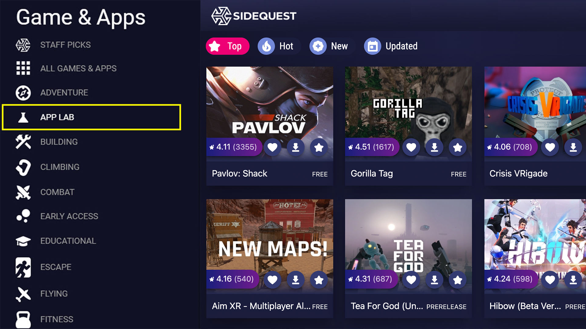
App Lab titles are browsable via SideQuest, but these apps can only be found within the Quest Store by searching their full title exactly.
While App Lab submissions must abide by Oculus’ VRCs, several checks have been relegated from requirements to recommendations, making App Lab far more likely to approve your app than the Quest Store is. App Lab submissions are also reviewed on a first-come, first-serve basis and, although review times will vary, these windows are generally quicker than those of the Quest Store.
App Lab’s more straightforward approval process means that its library is growing far quicker than that of the Quest Store. With a current catalog comprising over 500 games and new ones being added every day, apps distributed via App Lab without any congruent marketing plan run the risk of sinking in this vast sea of options. Although SideQuest allows users to browse through the entire App Lab library freely, the Quest Store will only show these titles if you search their entire names precisely as listed. For example, searching Pavlov Shack through the Quest Store will not yield any results, but searching Pavlov Shack Beta will. Because so few people will naturally stumble across your App Lab game, you bear the responsibility of making sure your app gets seen.
SideQuest
SideQuest is essentially a giant, third-party store for Oculus Quest. It enables you to sideload games and apps onto your headset, provided you have access to a computer or mobile device. This distribution channel is the least accessible of the three as it also requires users to have their headsets in developer mode. However, unlike the Quest Store and App Lab, SideQuest submissions do not need to be approved by Oculus directly. Instead, these games and apps undergo a simpler, quicker administrative process that does not require your game to comply with any VRCs. SideQuest provides the quickest route for developers to share new builds with team members, playtesters, or friends.
Virtual Reality Checks to Keep in Mind
Getting an app approved by Oculus is easier said than done. Therefore, developers should be mindful of key VRCs as early as possible in order to ensure that major game design decisions are made with Oculus’ high standards in mind. After having undergone much of the optimization required to ready Loam Sandbox for official release, let’s briefly explore each of the eleven categories listed within the Virtual Reality Check guideline. This high-level overview of the requirements and recommendations will only apply to prospective Quest Store and App Lab games and apps.
1. Packaging
Packaging VRCs exist to ensure that every app available in the Quest Store and App Lab adheres to Oculus’ app packaging and formatting standards. There are six different required checks within this category regardless of whether you are submitting to App Lab or the Quest Store. One requirement, VRC.Quest.Packaging.5, requires that every submission be formatted as an APK file and smaller than 1 GB in size.
For a detailed look at the requirements that your app’s APK file must conform to, visit here.
2. Audio
The only Virtual Reality Check within this category is VRC.Quest.Audio.1, an optional recommendation for your app to support 3D audio spatialization features. Though not a requirement, incorporating audio spatialization within your game will mean that your app’s audio output will change as the user’s positioning does. We recommend that you consider implementing 3D audio within your games because doing so will add an immersive gameplay element, positively impacting player experiences.
3. Performance
Performance VRCs exist to ensure that the gameplay provided by titles available for Quest is of consistently high quality. This category comprises two App Lab requirements or three Quest Store requirements that concern your app’s refresh rate, runtime, and responsiveness.
Adhering to these checks can be difficult, thankfully there are several tools, such as the Developer Hub, that will enable you to accurately track the performance and overall functionality of your Quest apps. VRC.Quest.Performance.1 requires all App Lab and Quest Store listings to run at specified refresh rate minimums of 60 Hz and 72 Hz, respectively. You’ll want to keep this VRC in the back of your mind as you develop your game because its performance will benefit greatly from finding alternatives to CPU-intensive design choices.
We suggest using transparencies sparingly; whenever we made too many of Loam’s colors or textures see-through, we would experience drastic dips in frame rate. We also noticed that rigging critter skeletons within Unity would create a similar effect. To hear art optimization insights directly from our team, visit here.
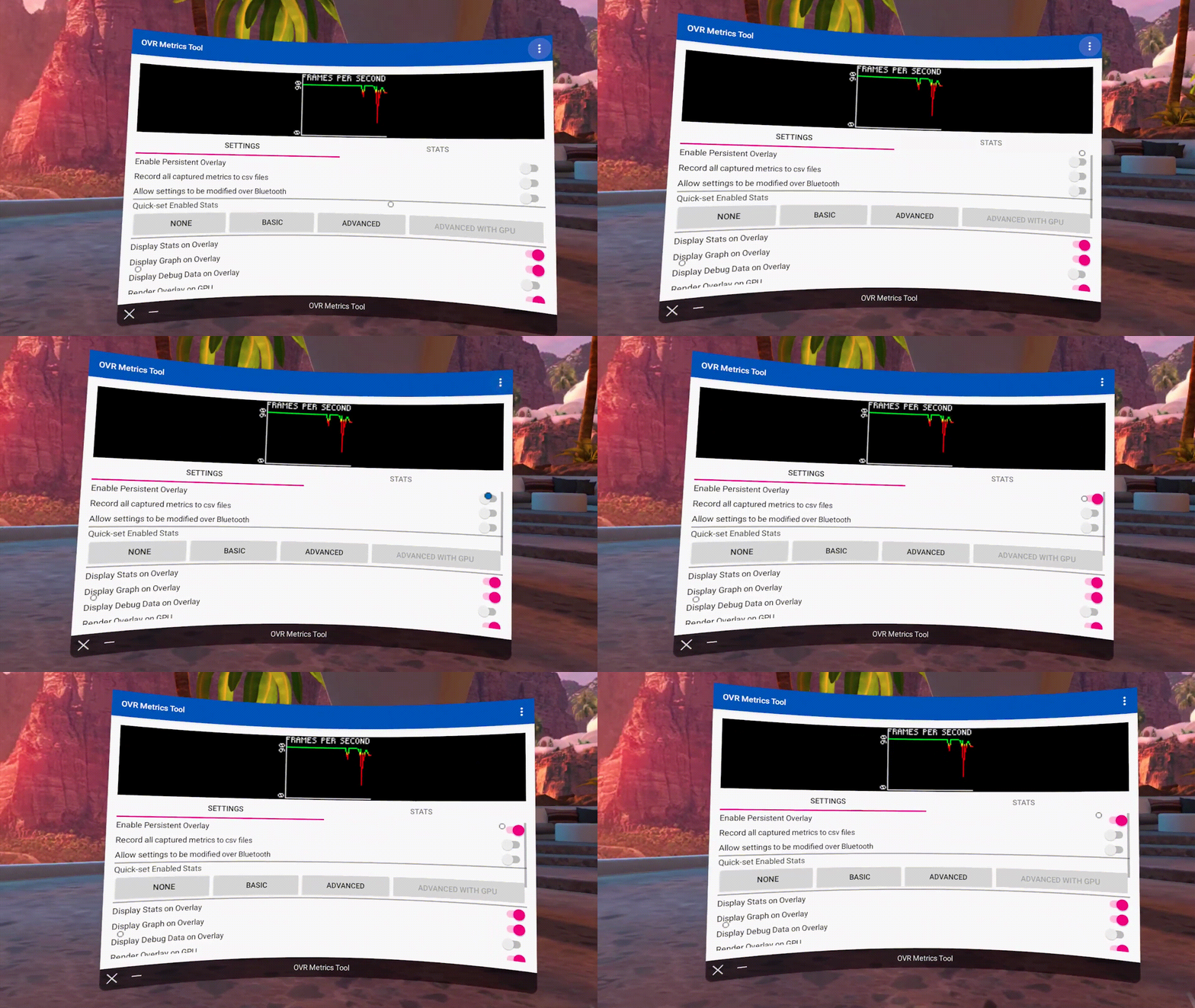
We recommend sideloading OVR Metrics onto your headset and toggling on its persistent overlay setting. This will provide a real-time display of your app’s frame rate as you test its performance.
4. Functional
Oculus has created thirteen functional VRCs to ensure that all apps listed on App Lab and Quest Store run smoothly. Together, they prevent crashes, freezes, extended unresponsive states, and other game-breaking errors. Four of these checks are recommendations for App Lab submissions, while only one check is a recommendation for the Quest Store.
Developers seeking a spot in the Quest Store should keep VRC.Quest.Functional.1 in mind as they produce their games and apps. Because it requires you to be able to play through content for at least 45 minutes without any major errors, crashes, or freezing, this check could potentially impact your game’s design. VRC.Quest.Functional.1 is merely a recommendation for App Lab submissions, making that that ideal distribution avenue for early access games and demos not yet long enough for the Quest Store.
Visit here for a complete list of functional VRCs.
5. Security
Two security VRCs ensure that every Quest app respects and protects the privacy and integrity of customer data. Made up of one recommendation and a requirement, this is among the more straightforward categories. VRC.Quest.Security.2 is the only security check that developers must abide by; it requires your app to request no more than the minimum number of permissions needed for it properly function.
For more details, visit here.
6. Tracking
The tracking category of VRCs consists of one mandatory check for both Quest Store and App Lab submissions. To comply with VRC.Quest.Tracking.1, your app’s metadata must meet Oculus’ requirements for sitting, standing, and roomscale play modes. You can take in-depth look at this Virtual Reality Check here.
7. Input
Seven input VRCs relate to your app’s controls scheme and commands. This category is comprised of four and five requirements for App Lab and Quest Store, respectively; they function to maintain consistent interactivity from one Quest app to the next. For example, VRC.Quest.Input.4 makes sure that, when the user pulls up Quest’s Universal Menu, every Quest app continues to render in the background but hides the user’s hands.
If you plan on implementing hand tracking within your app, you’ll need to pay particular attention to this category. View all seven VRCs within the input category here.
8. Assets
Each of the eight VRCs included within this category is required of Quest Store submissions, but only half are needed for App Lab titles. These checks refer to the assets that will accompany your game within each distribution channel, ensuring that your app’s logos, screenshots, description, and trailer meet Oculus’ expectations. Though you may not be required to abide by every check if you’re looking to submit to App Lab, it’s important that you consider every check as you plan and create the marketing materials that will help your game stand out.
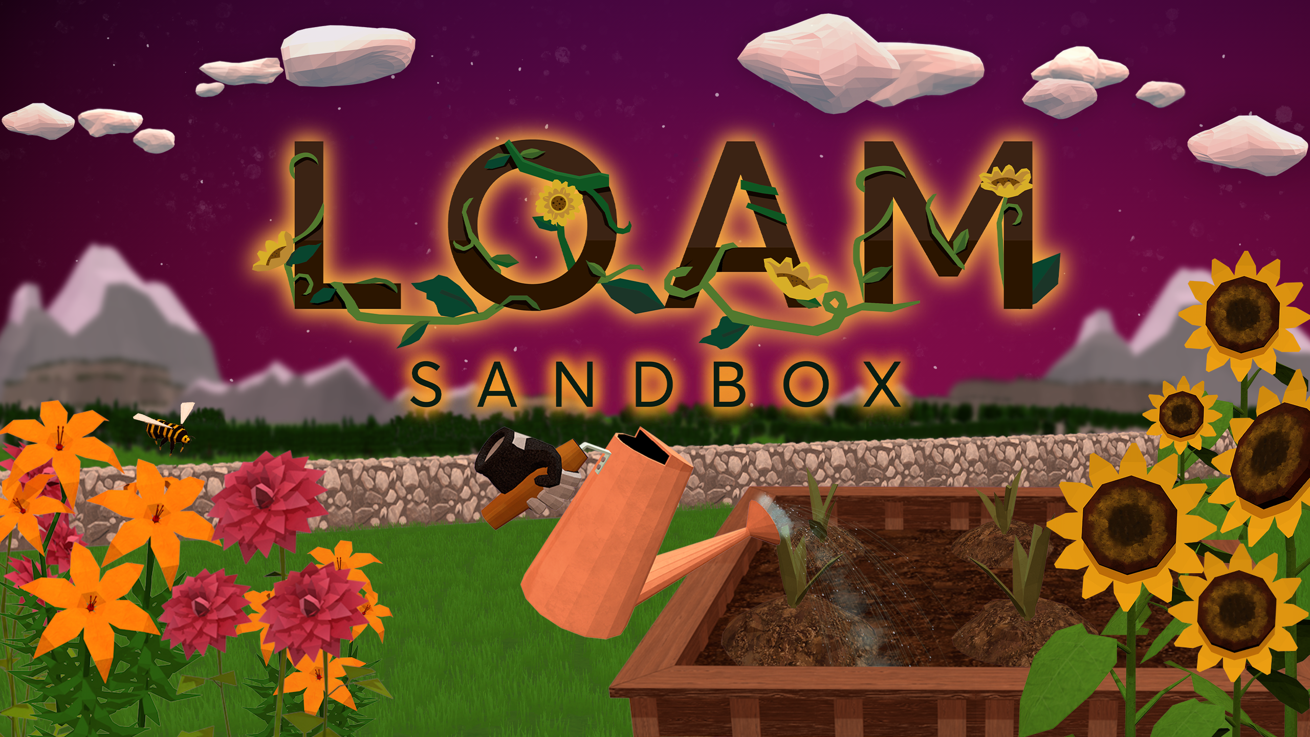
Clear cover art, for example, is only a requirement for the Quest Store, but this is an asset that will undoubtedly help your game stand out on App Lab too. Keep in mind that you will need multiple cover art images of different sizes and dimensions in order for your graphics to look their best in different areas of these distribution platforms.
As you plan your game’s trailer, you should keep VRC.Quest.Asset.7 in mind—a required check limiting your trailer’s length to two minutes or less. While recording, take advantage of SideQuest’s ability to run ADB commands on your headset and alter the dimensions and bitrate settings of your Quest’s native screen-record feature. Also remember that, due to VRC.Quest.Asset.6, no asset accompanying your game can feature another VR platform’s headset or controllers.
9. Accessibility
Although none of these checks are requirements for either distribution channel, the accessibility category spans nine recommendations, making it among the largest sections in throughout the Quest Virtual Reality Check guideline. Failing to incorporate any of these suggestions won’t invalidate your submission, but we recommend developers implement these checks as well because they make sure that your game accommodates a variety of users.
Making adding subtitles, making text clear and legible, and incorporating color blindness options within your app’s settings are invaluable ways of making sure that it is accessible to the broadest audience possible. For ever suggestion within this category, visit here.
10. Streaming
Streaming VRCs exist to guarantee all Quest apps are capable of providing smooth streaming experiences. VRC.Quest.Streaming.2 is the only required streaming check, making streaming among the simpler categories to comply with. You’ll just need to make sure that your app can only stream VR content to local PCs that the user has physical access to.
11. Privacy
Five required privacy checks ensure that all games comply with Oculus’ Privacy Policy requirements. Your app’s Privacy Policy must clearly explain what data is being collected, what it is being used for, and how users may request that their stored data be deleted. All five checks included within this category are requirements for titles on either the Quest Store or App Lab.
Click here for more information regarding Oculus’ Privacy Policy Requirements.
Have you submitted an app through the Quest Store, App Lab, or SideQuest? Are you planning to do so? Let us know what your submission process was like by leaving a comment below or tagging us on Twitter: @AmebousLabs

Written by Nick Foster
GAME ART DESIGN FOR VR: FORM AND FUNCTION

Written by Nick Foster
Designing art for virtual reality games is to wrestle form with function. All things naturally have a form or shape–an outward appearance that differentiates one item from the next. Similarly, all art has a purpose or function, whether expressive, utilitarian, or persuasive in nature. Louis Sullivan, an influential architect from the late 19th century, believed that “form follows function.” Of course, he did not create his philosophy with VR game design in mind, but his ideas continue to be altered, debated, and applied to all forms of art today.
As we near the release of Loam Sandbox, we can begin to reflect upon the lessons learned while designing the VR gardening game’s art and consider how Sullivan’s guiding tenet influenced the choices, sacrifices, and concessions we had to make to get Loam looking and functioning how we wanted it to.
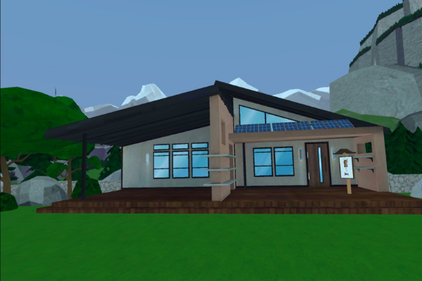
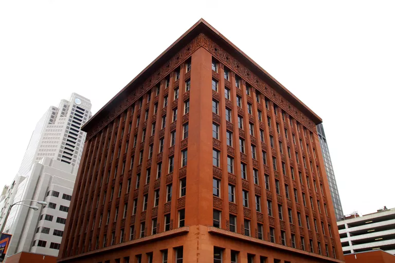
Sullivan pioneered the American skyscraper; he believed that each skyscraper’s external “shell” should reflect its internal functions.
Loam began with a purpose; we wanted to make a relaxing gardening simulation game in virtual reality. With that in mind, we started researching environments that would take advantage of the immersion provided by Oculus Quest headsets without inhibiting the game’s overall goal.
From the very start, Loam’s form followed its function. We ultimately decided that Loam’s setting would be a mountain valley region because the setting facilitates realistic gardening while providing a vast landscape that shines when showcased in virtual reality. Even when developing non-VR games, it is essential to consider how your game’s setting interrelates with its core gameplay.
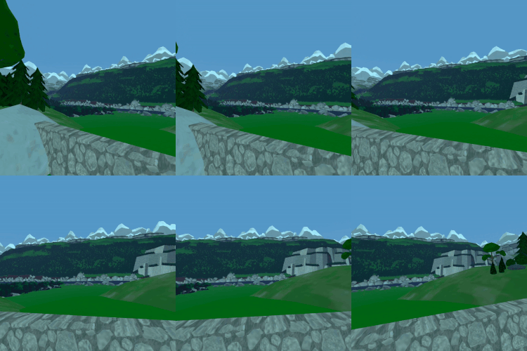
Now, with a basic understanding of Loam’s setting, we continued to research mountain valley regions and their associated cultures. Knowing that we wanted this game to be a relaxing respite for players, we used this research to hone in on the tone and feel of the game.

Hygge is a popular theme across Scandinavian cultures but is especially prominent in Denmark and Norway. Because this idea of comfort and the feelings of well-being that accompany it aligned so heavily with the function of Loam, it inevitably had a significant impact on the visual form of everything we see in Loam, from its architecture to the game’s textures and assets.
As we grappled Loam’s comforting visuals with its gardening gameplay, we also had to consider the game’s functionality as a whole in terms of its ability to run smoothly on both Oculus Quest and Quest 2 headsets. Before either the Oculus Quest Store or App Lab can distribute a game or app, it must meet the stringent Virtual Reality Check (VRC) guidelines set forth by Oculus.
These VRCs are yet another example of the role Loam’s functionality played in determining its visual form. These guidelines exist to ensure that all games on the platform are of a consistently high standard; unfortunately, meeting these guidelines often requires the alteration or removal of certain elements and assets.
Your game’s performance is a common reason you might retroactively modify your game’s form to align with its function, but another critical aspect to consider is the player’s experience, especially when developing virtual reality games.
Playtesting is an invaluable opportunity to ensure your game is not off-putting to players. Feedback from players will help you better align your game’s form with its function. By playing your game vicariously through a playtester’s fresh eyes, you’ll discover aspects of your game that should be improved, removed, or implemented.
Join our discord to keep up to date with every change we make to the world of Loam leading up to the release of Loam Sandbox.

Written by Nick Foster
KICKSTART YOUR CAREER IN GAME DEVELOPMENT

Written by Nick Foster
Let’s face it, we all want to make games. Game development offers a uniquely rewarding career that allows you to celebrate your work in unusual ways. In what other industry are you afforded the luxury of being able to literally play with your work? Luckily, every great game needs a team behind it—people who can design gameplay, implement sounds, write code, create assets, and playtest each build. Because game production blends technical abilities and logic with artistic expression and creativity, there’s a role for everyone regardless of your skillset or interests. Take our team, for example:
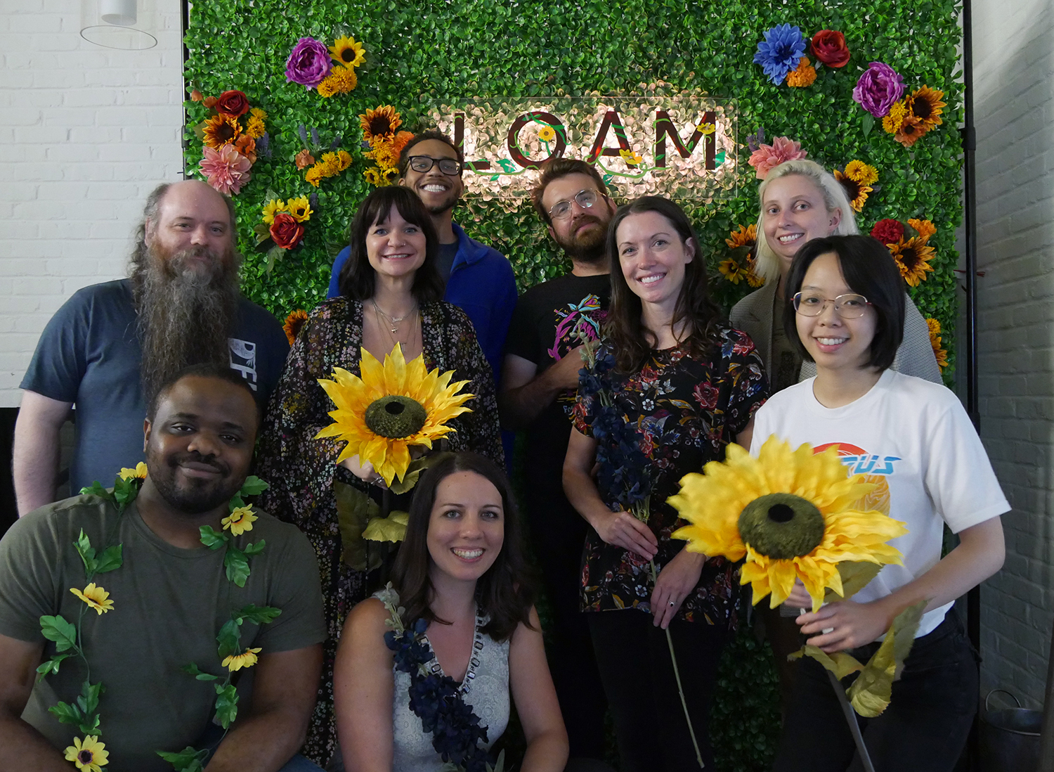
With so many accessible, often free online resources at your disposal, there’s never been a better time to enter the gaming industry. However, just like any other significant undertaking, figuring out where to begin is the hardest part. Whether you want to make game development your new career or your next hobby, our team of developers and artists will share within this article their go-to tools and resources, plus their suggestions for professionals looking to break into the industry.

With so many resources at your disposal, there’s never been a better time to enter the gaming industry.
Our team’s best advice for an aspiring game artist or developer would be to start small and think big. If you’re interested in forging a career in game development, then you should be prepared to spend time developing your abilities and familiarizing yourself with the software and languages you anticipate using the most. With that said, the best place for you to start your journey might actually be away from the computer.
You can’t start designing games until you start thinking like a game designer! Creating your own board game is an incredibly effective introduction to the world of game production. When you look at the steps involved, producing a board game is surprisingly similar to video game production. Regardless of their medium, every game needs a working set of rules designed with players in mind, then they eventually need playtesters to highlight potential improvements for the next iteration or build.
At the moment, many aspiring 3D artists and developers are denied the hardware needed to develop satisfying video games simply because it is too expensive to acquire. This is another reason board games are a great place to start, but if you’re truly ready to take the next step, we suggest taking advantage of the local opportunities unique to your area. By participating in meetup groups and organizations like the International Game Developer’s Association (IDGA), you may find regular access to the expensive hardware you’re seeking.
To craft the magical world of Loam, our team uses the game engine Unity, which you can download and start learning for free. As you familiarize yourself with Unity (or your engine of choice) and start producing your game, you will inevitably encounter obstacles. Bringing questions to your local meetup group is a great way to gain new insights, but this is not always possible. Thankfully, there are a plethora of free and accessible resources online!
Meeting others with similar interests, skills, and goals is perhaps the most exciting aspect of pursuing any passion. While attending college facilitates limitless networking opportunities, it is not the only path for aspiring developers or artists. Above all else (including degrees), you should value your portfolio, your previous work experience, and your connections in the industry. With so many possible ways to enter the industry, here is how our team managed to do so:
Aspiring game artists and developers should be prepared to spend lots of time refining their trade. Again, start small and think big; with consistent practice, you’ll start to master your software, understand programming languages, improve your artistic vision, and perfect your creative abilities.

Written by Nick Foster
GNOME DOMAIN IN TILT BRUSH

Written by Shelby Vecchio
Game art is a valuable tool in creating immersive in-game worlds. It is so much more than a set of visuals—game art assumes the premier role in establishing a story’s environment and industrial design. It is the vital puzzle piece linking together strong user interfaces and interactive designs to create successful games.
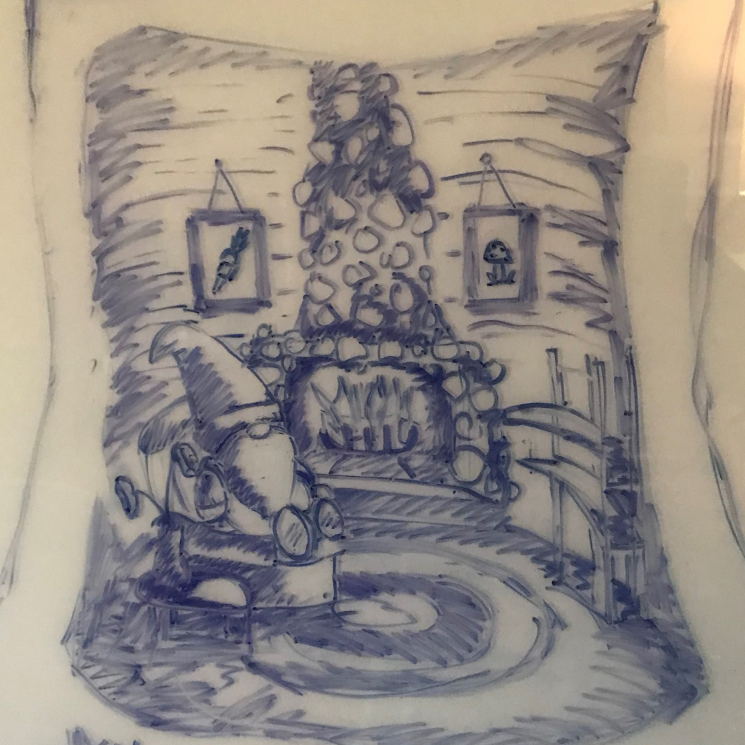

Game art is more than just visuals, it establishes the environment and industrial design of the story.
As Loam’s art director, I not only set the visual standard and overall tone of the graphics, but I also contribute to the development of the game’s art. In doing so, I play a major role in defining the world of Loam. With help from a team of talented artists, we can shape the look and feel of the game. Sometimes, exploring environments and characters that won’t directly appear in-game is an excellent way of adding depth to the game’s world. Take Loam’s gnomes, for example. Have you ever wondered where they go to sleep?
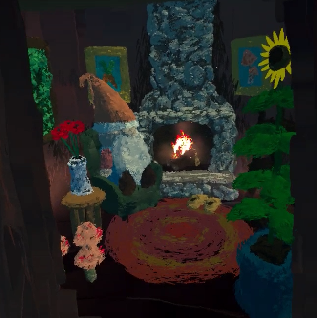
I’ve heard that homes can reveal tons of information about their owners’ characteristics, values, and personalities. Throughout the creation of this piece, I learned so much about the gnomes of Loam. After sketching out my initial ideas, I threw on a VR headset and took my curiosity to Tilt Brush to unveil what a gnome’s home looks like in Loam. The room’s snug, cozy ambiance shows me how much these little guys value comfort and relaxation and, considering their homes are located within trees and filled with floral decor, it is safe to say that Loam’s gnomes are deeply in touch with nature.
Watch the video below for a full time-lapse of this Tilt Brush gnome home creation!

Written by Shelby Vecchio
PRE-PRODUCTION: WHY IT’S UNDERRATED

Written by Amy Stout
There is much more to game development than meets the eye. Even simple games with straightforward concepts underwent massive amounts of research, ideation, theorizing, testing, prototyping, iterating, and programming before eventually becoming what you recognize them as today. Looking back at what we’ve done thus far in developing Loam, there is one noticeably underrated step of game development that stands out: pre-production.
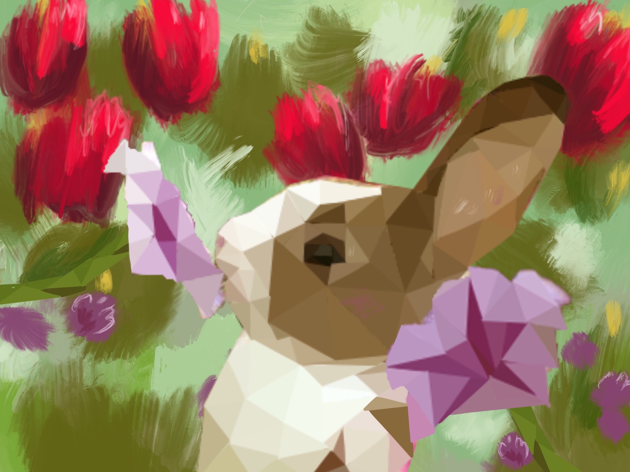

This is the point where you place the North Star that guides your game.
Pre-production is the first stage in a game’s development process. Characterized by endless questions and infinite possibilities, this is the point in the production lifecycle where you place the North Star that guides your game toward your vision. Pre-production may be daunting initially, but it becomes more manageable when you work through it one step at a time. This article outlines the critical steps of the pre-production phase in no particular order. Please feel free to jump around and iterate as needed—you may realize that a once brilliant idea may no longer fit the overarching theme of the game when you start filling in more detail.
Land on a Central Theme
Whether a team is small and independent or large and well-funded, establishing a central theme to build the game upon is a crucial step of pre-production. Taking into consideration that everyone has a distinct creative process, our team at Amebous Labs went about this step in multiple ways:
- We met collectively to throw out ideas and complete prompts that tested our imaginations, forcing us to think outside the box.
- We also had solo brainstorming sessions and shared our concepts with the team via two-minute pitch presentations. With so many great ideas to work with, we picked two of our favorites and split into teams to get started on the details. After a week of fleshing out these concepts, both groups presented their pitches. Together, we discussed what would work for VR and identified potential threats to the development process.
- We sought out and incorporated outside perspectives to land on our idea for Loam.
While this process will not be ideal for every team, it proved to be an uncomplicated way for us to consider everyone’s ideas. No matter how you decide to determine your theme, be sure to look at the whole picture by asking questions like: What artistic or development challenges do you anticipate encountering? Can you overcome these challenges with the resources available to you? What does the competitive landscape look like? How can I monetize the game? Is there a gap in the market for a game like this one?
No other phase of game development allows for as much creative freedom as pre-production does. Fully formed ideas are not required at this point because there are still so many unknowns. So rather than focusing on the details, have fun brainstorming some themes, see which interests you the most, and then pick a viable option.
Define Your Target Audience
You cannot please everyone. I learned early on that everyone has a different set of preferences in what they look for from gaming experiences. What one person finds enjoyable, others find unenjoyable. Even within our team, each member has varying interests and preferences. This means there is no right or wrong answer to game design. Instead, define your target audience and design your game with them in mind.
With that said, a game’s playerbase is not limited to its user personas. Someone who does not identify with your outlined user personas may play and enjoy your game just as much as someone who fits that demographic perfectly. Still, when we need to make decisions, we must first think about our target audience and ask ourselves if it aligns with their desires and motivations.
Check out this recent Under the Microscope article to discover how we created user personas for Loam.
Do Your Research!
Play games—lots of them. And as you play them, replace your mindset and biases with those of your target audience. What about this game resonates most with its superfans? Analyze every element that comprises the gameplay and consider which details attracted its devoted players.
Loam’s pre-production phase took place during a time when the team was working 100% remotely. Using Discord, we played a new game together each week in a series of aptly named “Game of the Week” meetings. Different members of our team suggested titles like Stardew Valley, Animal Crossing, Minecraft, Among Us, and Cook-out. The member that chose each week’s game would become the leader for that week’s play session, identifying their favorite parts of the game plus any potentially useful mechanics to keep in mind when making our own game. Not every game we played was within the same genre as ours, but we focused on specific aspects that we could use as prompts to start a conversation.
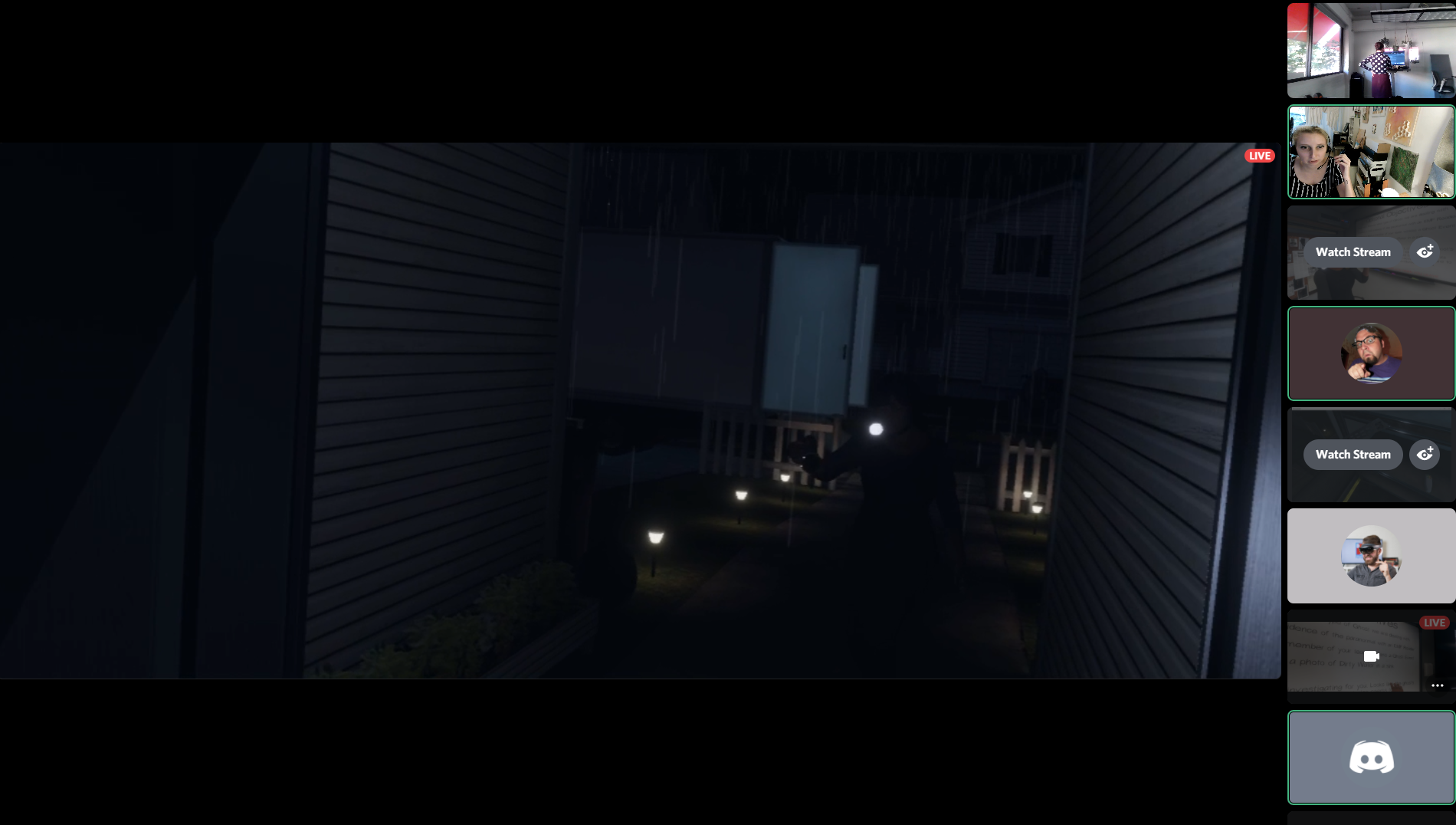
The team playing Phasmophobia during a special Halloween edition of Game of the Week.
If you are limited in resources or do not have access to certain games, then you’ll need to get creative. Find people on Twitch that stream relevant games and listen to what they have to say. Here, you will learn about your target audience’s motivations and where their frustrations lie within the current gaming landscape. If for no other reason, pre-production is underrated because its methods of data collection are so fun!
Figure Out How You Can Do It Better
Finding inspiration by observing how other games handle certain situations will save you time and frustration during development but avoid doing things the same way! Figure out how you can adapt and customize your findings to fit your game. Countless games are hitting the market each year, so yours needs to stand out. To do this, you must determine what your unique selling proposition will be. There must be something that makes your game more appealing to your target audience than the other games available today.
By no means should you have all the answers during pre-production, but you should start thinking about what you can do to make your game different. We accomplished most of our theorizing about Loam’s in-game mechanics and features during this stage of the development process. I suggest you consider prototyping these theories as needed and consider using temporary assets to speed up the process. We relied on our imagination and used cubes and cylinders as objects to determine whether or not the movements in VR felt natural and enjoyable.
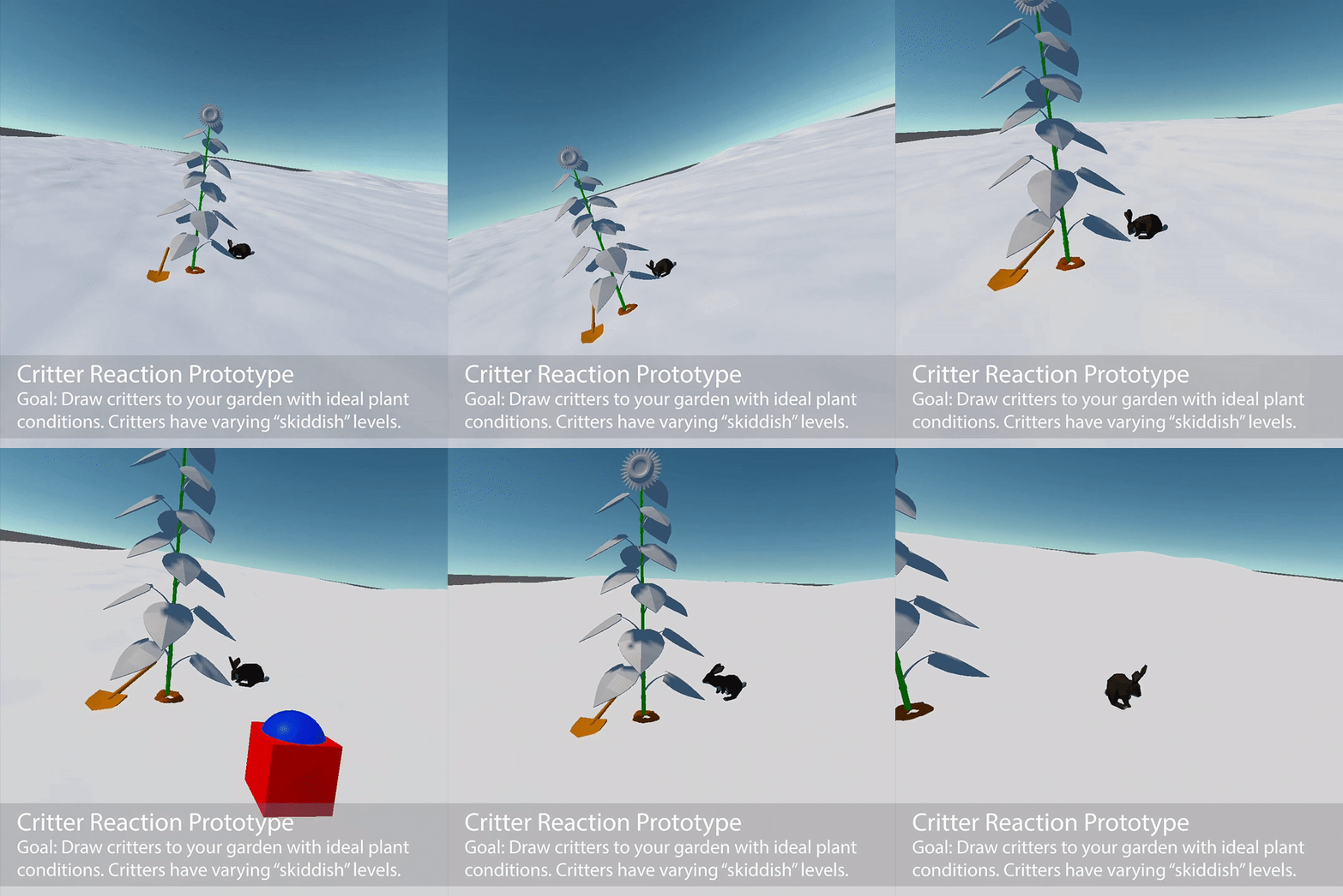
Early game footage featuring temporary assets.
Bring the Vision Together
The Game Design Document (GDD) and concept art complement each other well to help your team fully realize their vision. From this point on, any game elements you have decided upon belong in the GDD. Our team uses Confluence to document EVERYTHING in our game. It is a living, constantly changing document that we use as our source of truth. Any team member can log into Confluence and easily find Loam’s latest updates, notes, and decisions, but keeping it organized is a team effort. Here, pre-production planning comes in clutch. Create your hierarchy and organizational strategy during pre-production to ensure that everyone who touches the document keeps within those confides. It was intimidating to start the GDD, but it was easy to build upon once we had the framework.
We started our GDD as a shared Word doc. Ultimately, this did not satisfy our needs, so we moved it to Confluence. If you find out a process or software does not work well for your team, change it! Confluence’s features were well worth the time it took to migrate the information there from Word. Partway through the pre-production process, we also switched our project management software to Jira. It works in tandem with Confluence, making it super convenient to connect tasks and reference design documentation. Be open to reevaluating how you are staying organized as a team because what you needed at the beginning stages may not cut it a few months into development.
Concept art is the second major piece of the puzzle when creating the vision for the game. Concept art isn’t used in the game as is; instead, it guides a game’s style throughout development. Our Art Director, Shelby, drew maps and sketched out sample game objects that helped define what the world of Loam looks like today. We had visual inspiration to reference, but our goal was to create something unlike anything we have seen before.
Click here to dive deeper into how our art team created the look of Loam.
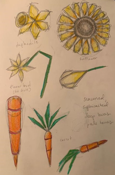
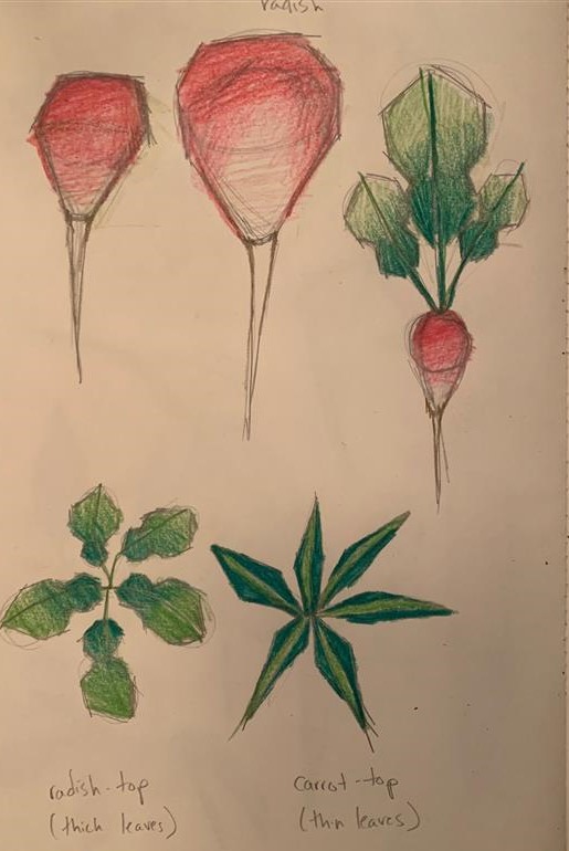
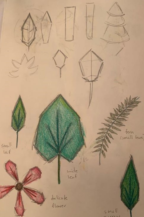
The concept art for Loam’s carrots, radishes, and leaves.
Logistics
The last part of pre-production that I’ll mention is logistics. By starting here, you may find your team better equipped to make decisions during other stages of pre-production. Whether or not you choose to begin pre-production with logistics, you should remember to consider the following points:
- Prioritize your must-haves. You will have to make compromises throughout the development process. Identify your non-negotiables early on to ensure you don’t lose focus.
- Plan your resources. If you are running a team, you should plan when people are available to work on the game.
- Budget your finances with your timeline in mind. Make sure you have enough funds to last through the duration of development with some left over to market the game. As fun as creating a game can be, you likely want people to play it. Keep that in mind when planning out your schedule and budget.
Regardless of the amount of planning you do, things will always change. We have learned an exorbitant amount about developing for the Oculus Quest platform over the past year as we try to push the boundaries of the headset’s capabilities. The platform is continuously evolving, forcing us to reevaluate possibilities at every turn.
Pre-production is underrated because it combines creative freedom and imaginative thinking with careful (but fun!) research and logistical planning. It provides a vital window for your team to hone in on the direction you’d like to take your game.

Written by Amy Stout
SIMPLIFIED NORMAL MAPS AND HOW TO CREATE YOUR OWN

Written by David Macias
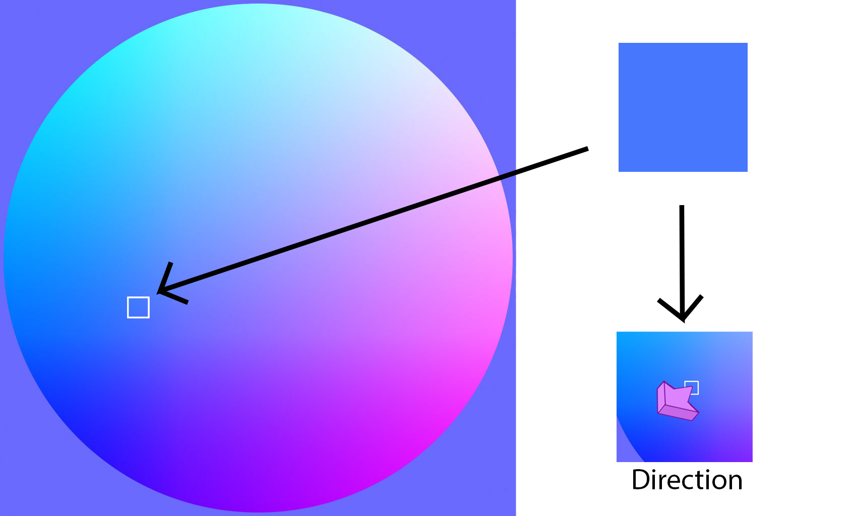
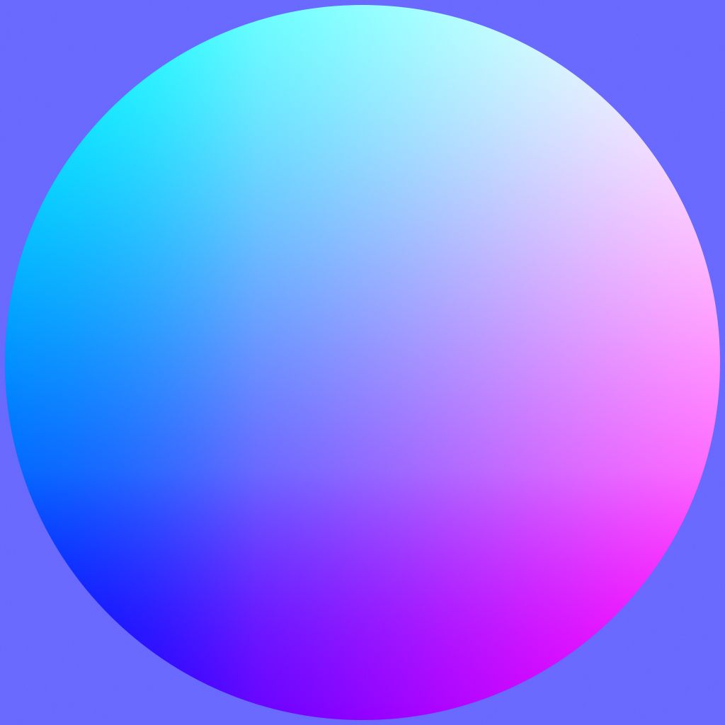
When getting started in 3D art and creating materials, the words “bump maps” or “normal maps” can bring a little confusion. The idea behind normal maps is somewhat complex but can be easily explained; A normal map is a texture that is used to generate detail in a mesh that doesn’t exist within the topology of the mesh. It takes the information in the map and uses it to fake angles in the mesh and reacts to the lighting in the scene accordingly.
Normal Map
For the sphere above, every color represents an angle direction. If we were to put this map on a plane and use it as a normal map, it would look something like this.
(Click on images to enlarge)
And if we turn the map on and off, it would look like this.
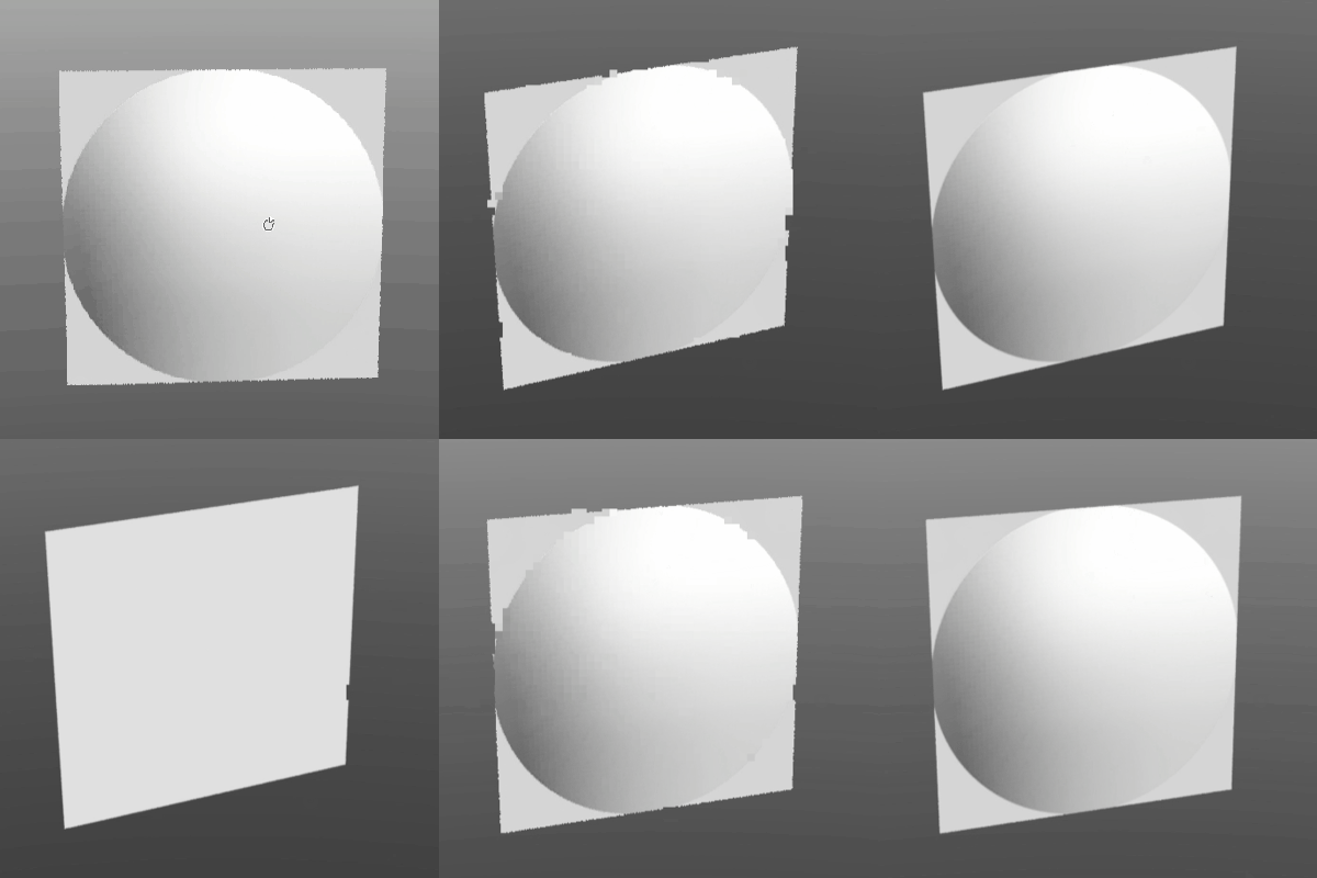
With a little specularity and light, we have a flat sphere.
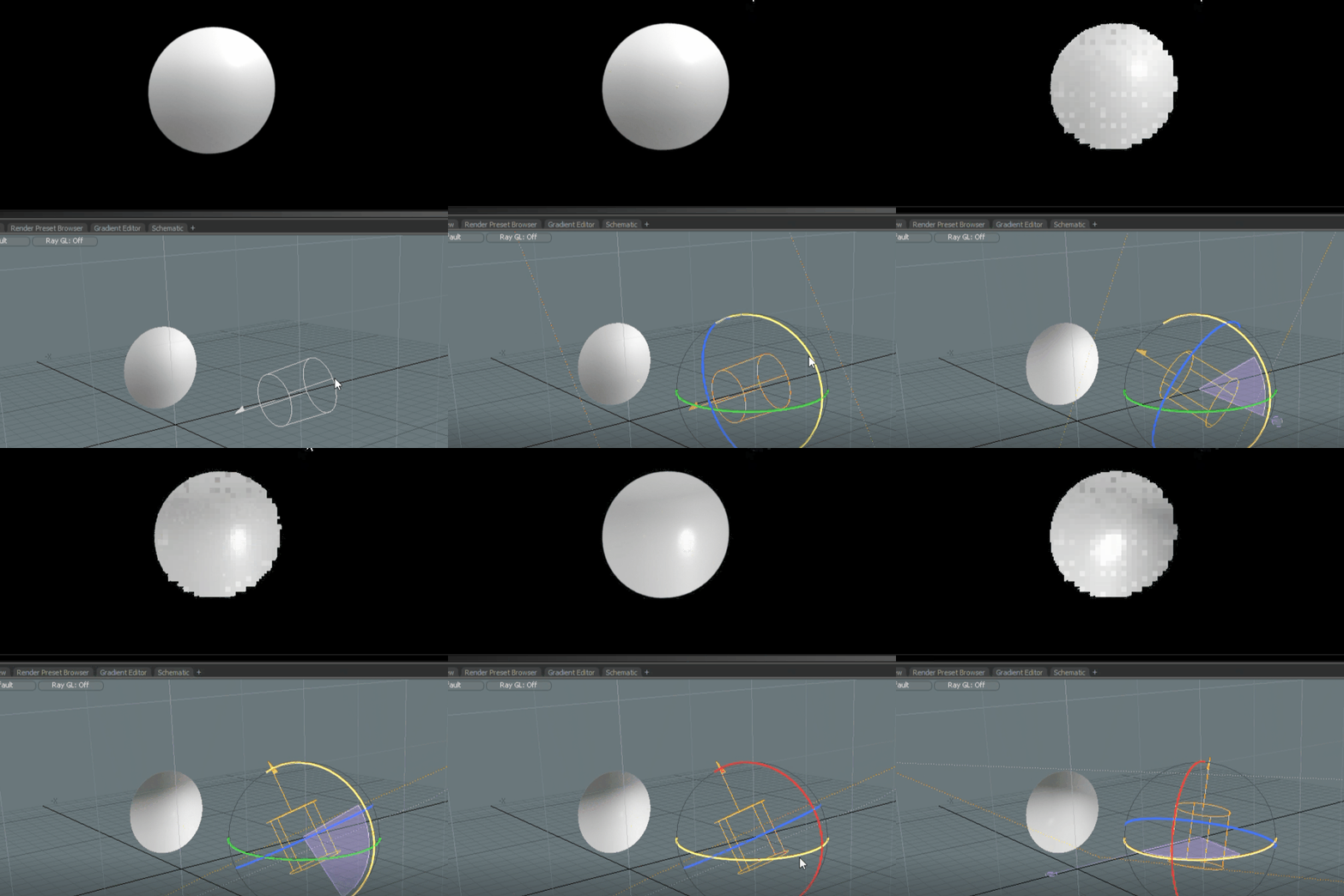
In the image below, if I color selected in the white square (left), that color (top right) would be read as the direction it’s pointing from the sphere.
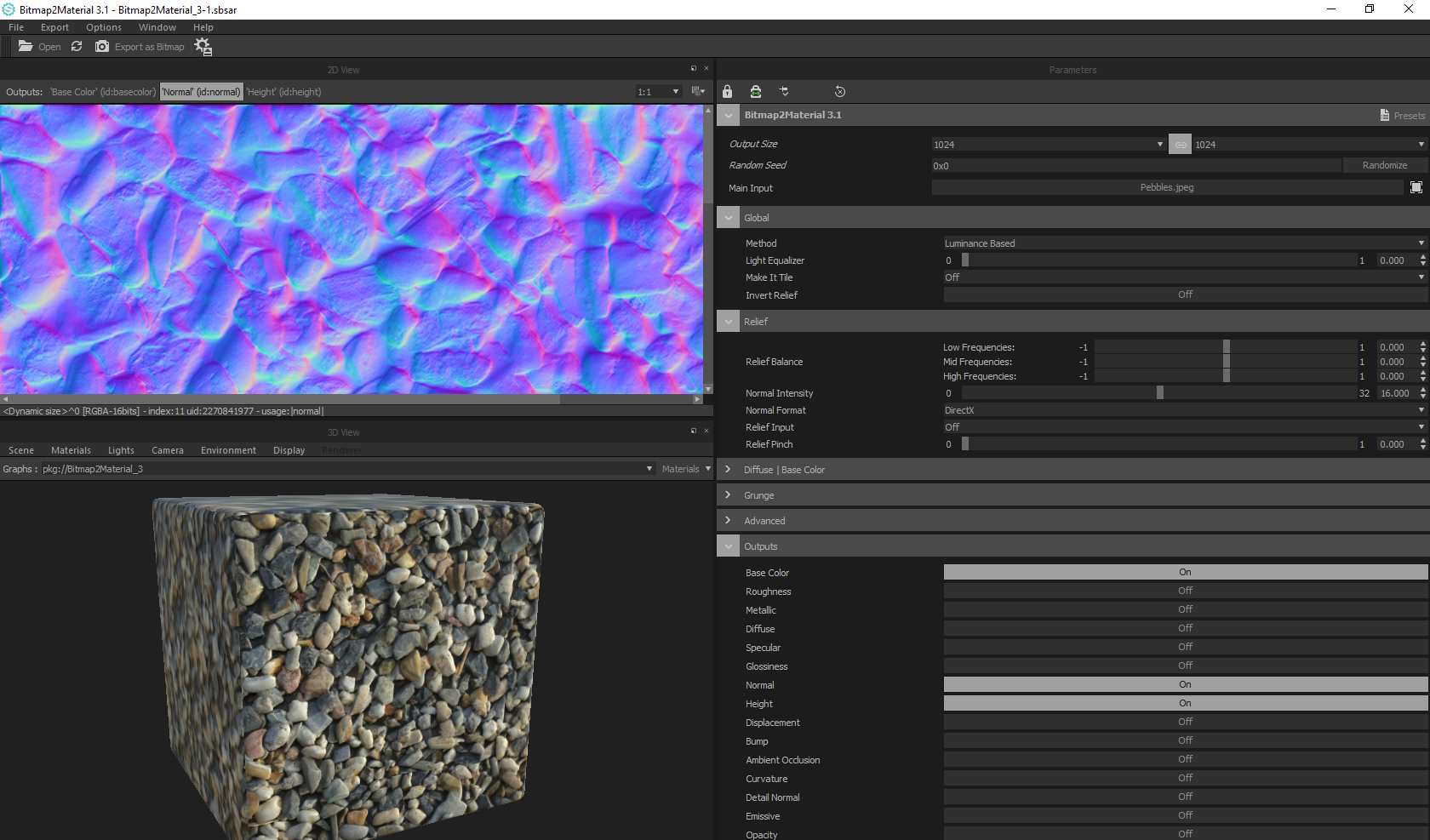
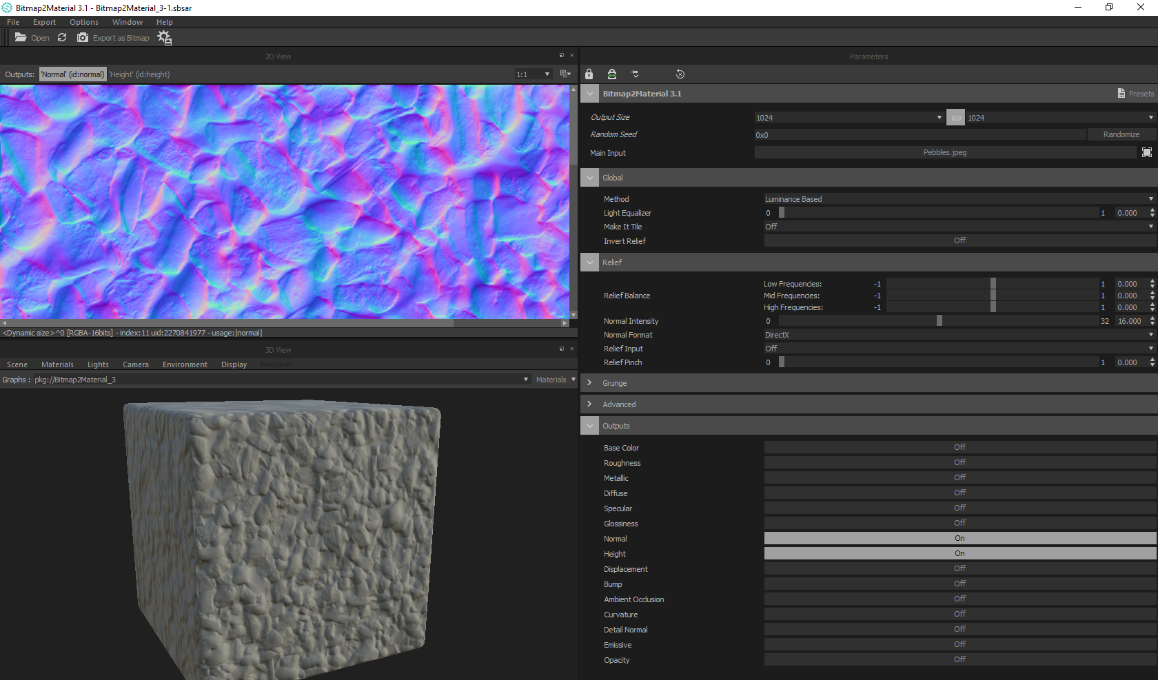
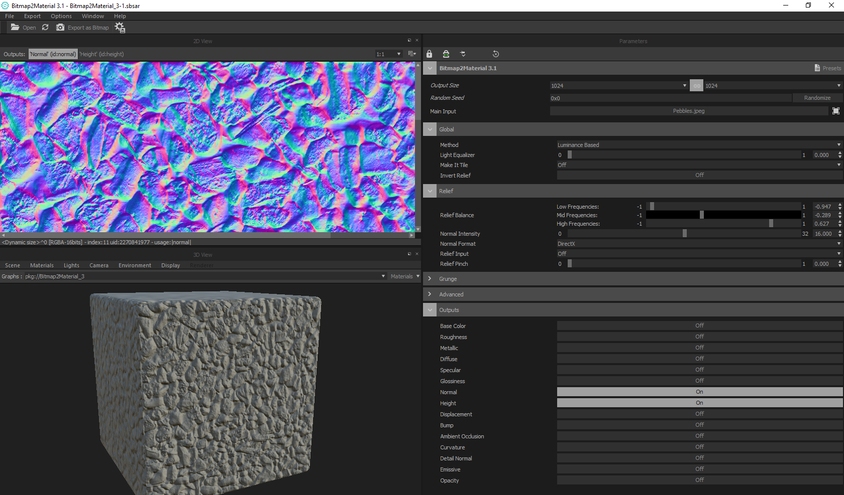
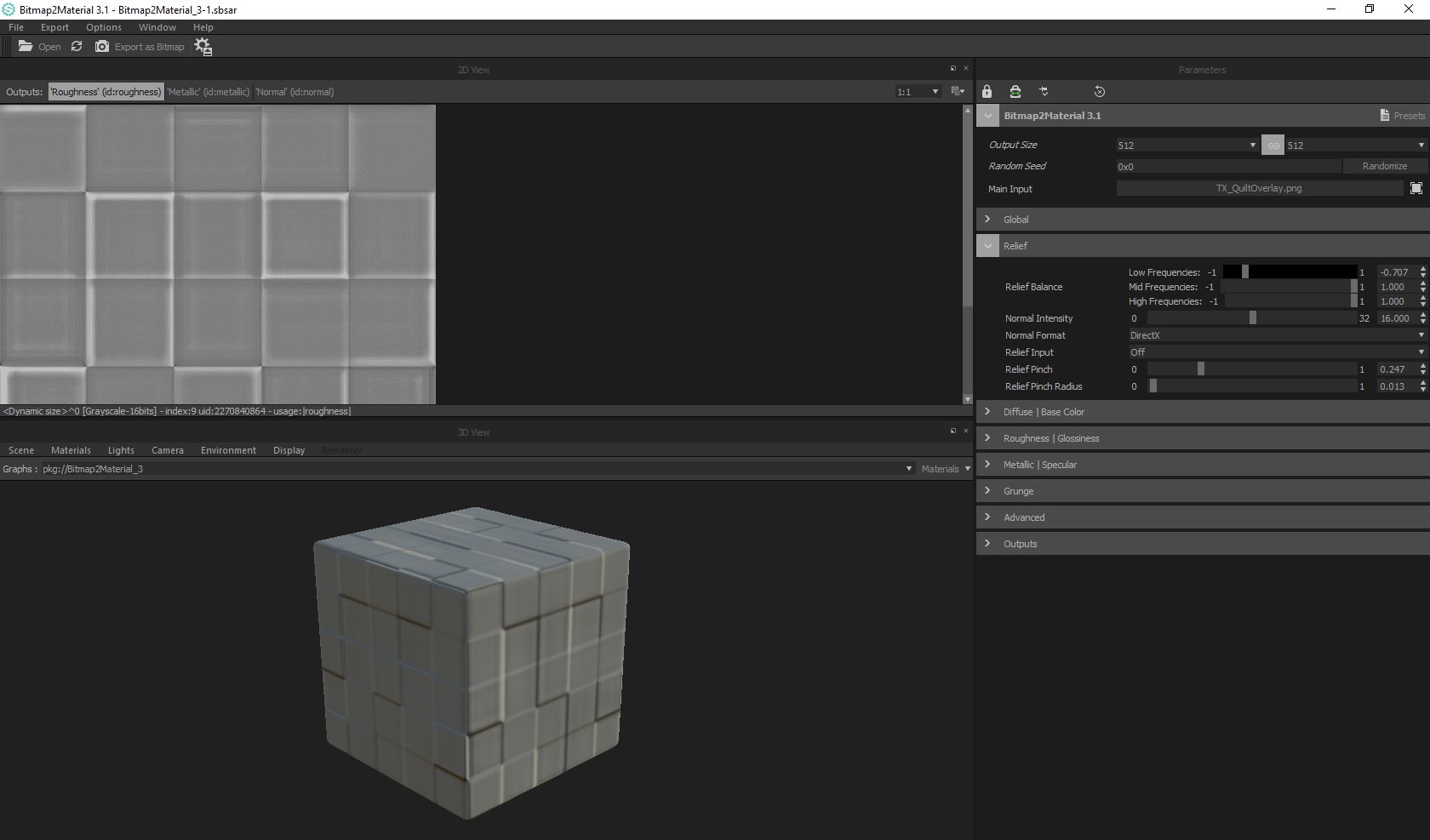
Here is a bit more of a detailed example using a tiling pebble texture I made from an image in Substance Bitmap2Material.
Tiling pebble texture that has generated a normal map from the surface lighting
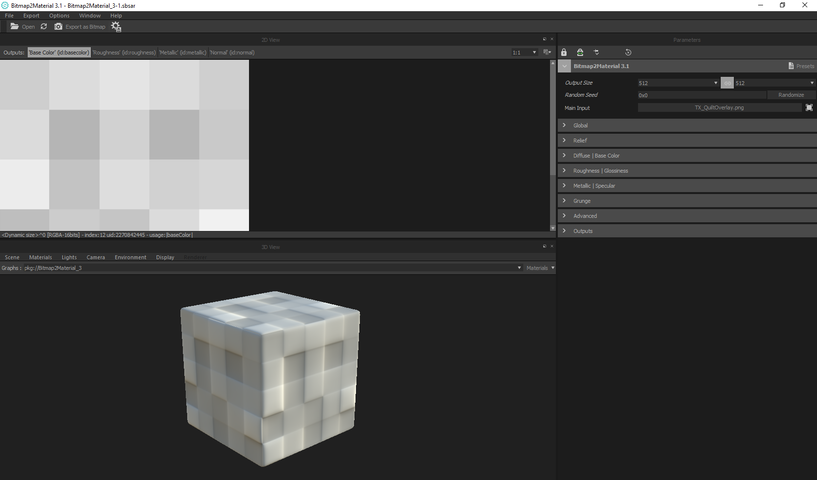
Bitmap2Material (B2M) works great for textures like the one above, but it doesn’t work as well for something like this pixelated greyscale texture I previously made. It has a hard time making clean edges, and while it can still be done to certain levels of success, this is a good situation where creating your own normal map would be a better solution.
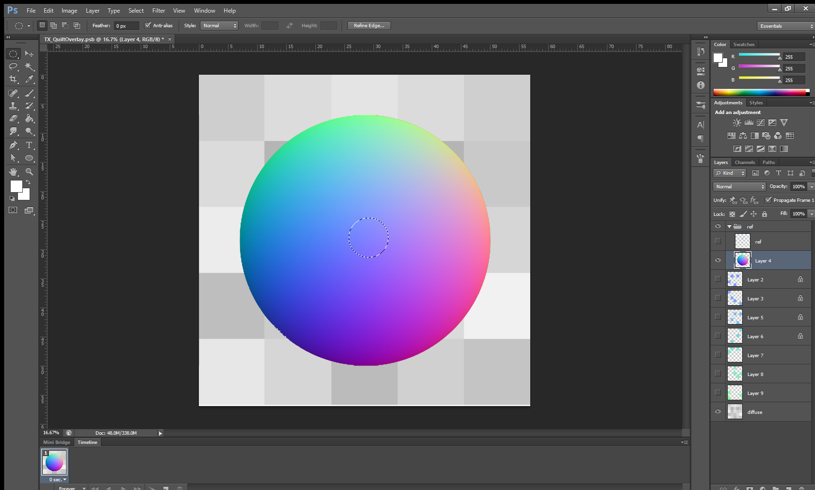
Now, knowing how normal maps work, we would only have to color pick from the normal sphere texture and paint the surface detail we want to create in our custom normal maps. I’ve painted a simple normal map for our game, Loam, to use in a water shader with the pixelated texture above, and these are the steps I’ve taken.
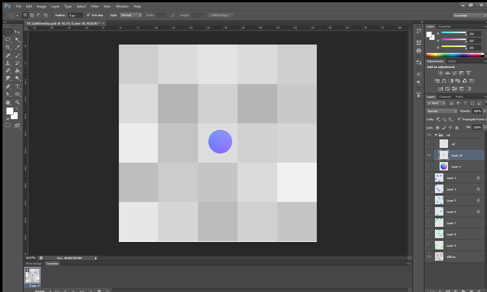
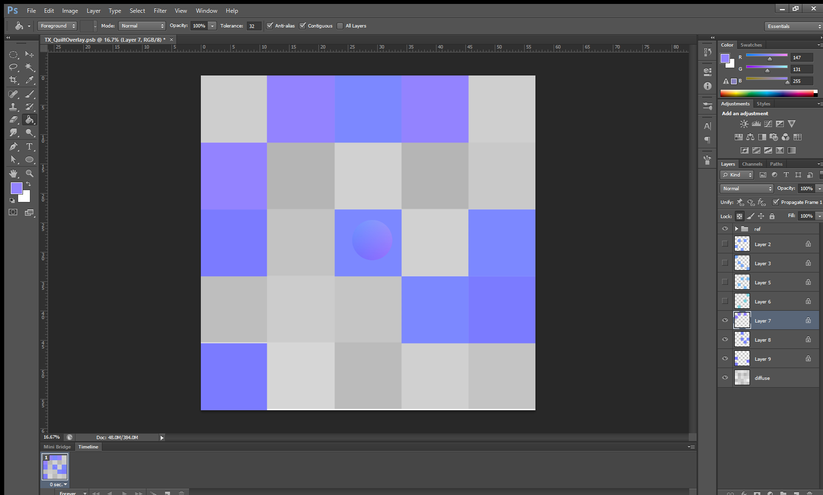
I took a normal sphere texture, brought it into Photoshop, and kept it as a reference. In the image above, I’ve isolated the center of the sphere because I only want samples of the forward-facing colors. (The surface of calm water is variations of forward-facing angles).
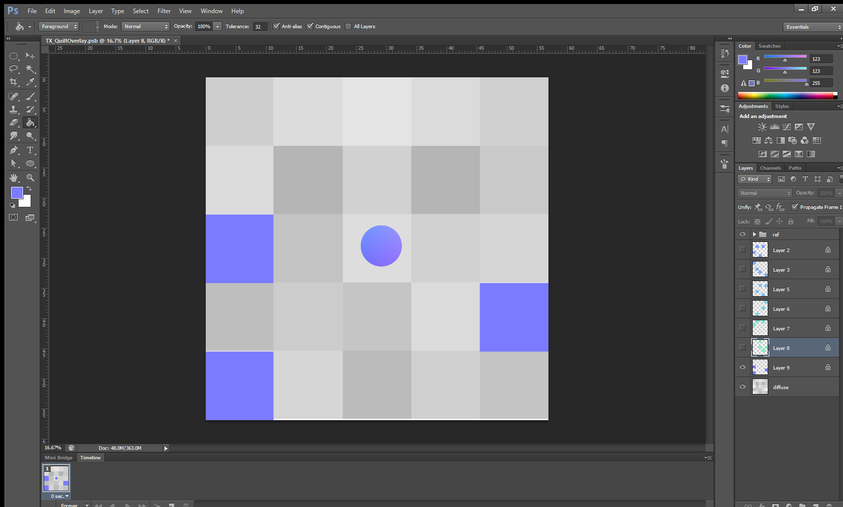
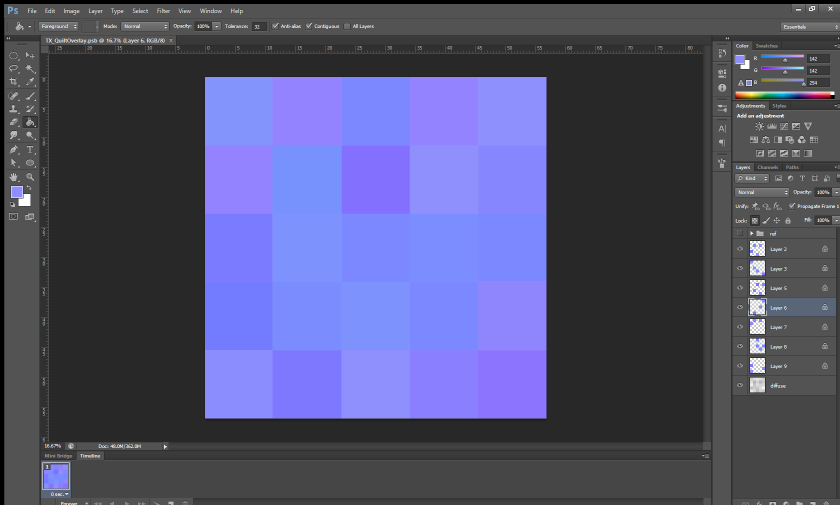
I selected and painted each background square a different color, and I continued this process until I ended up with a nice variety of colors and a complete normal map.
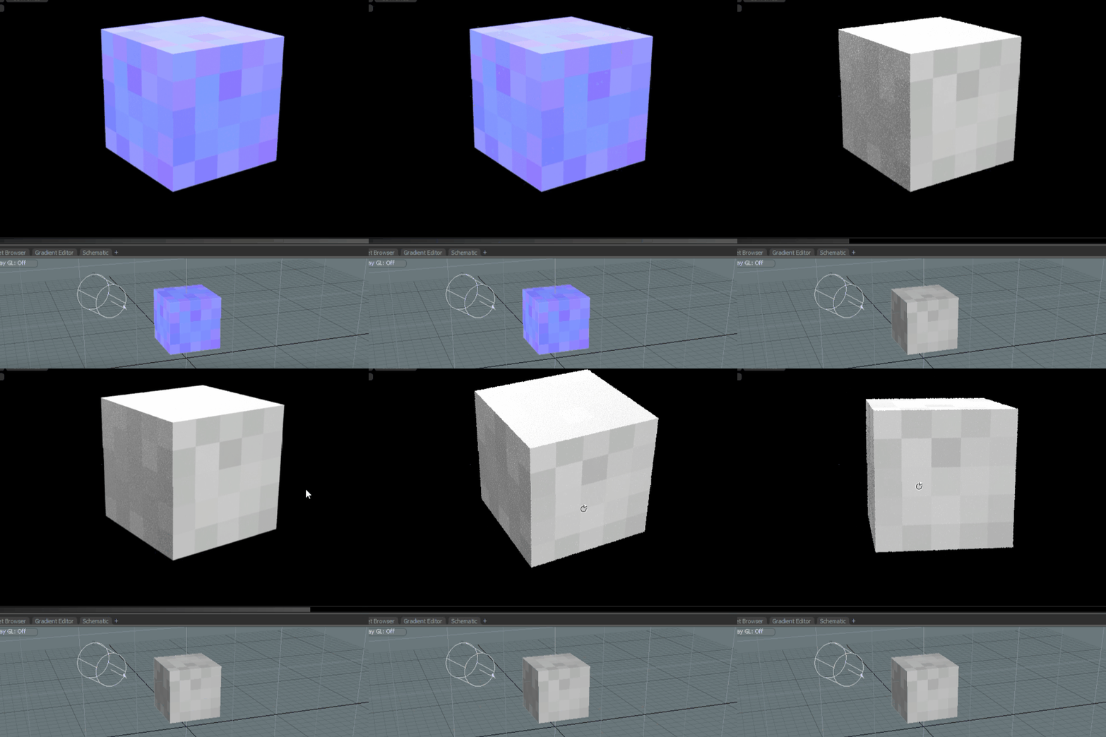
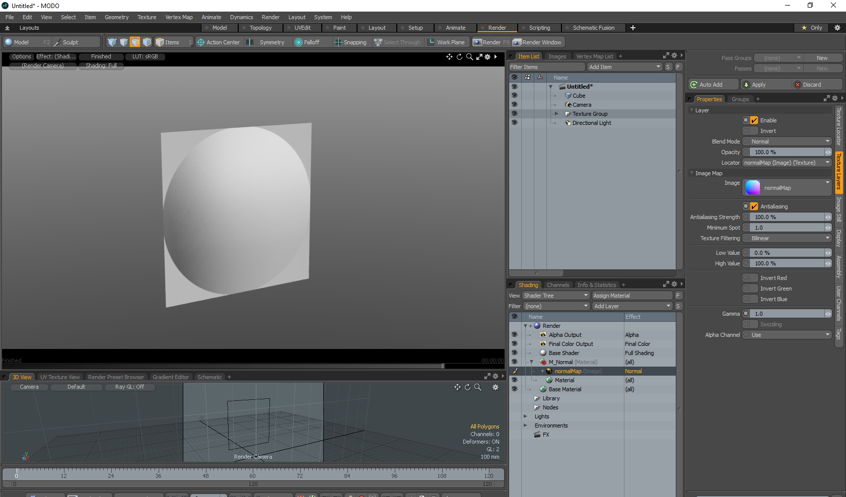
I brought the normal map into Modo to test it out. On a simple cube mesh, I applied a new material and set the normal map as the normal input.
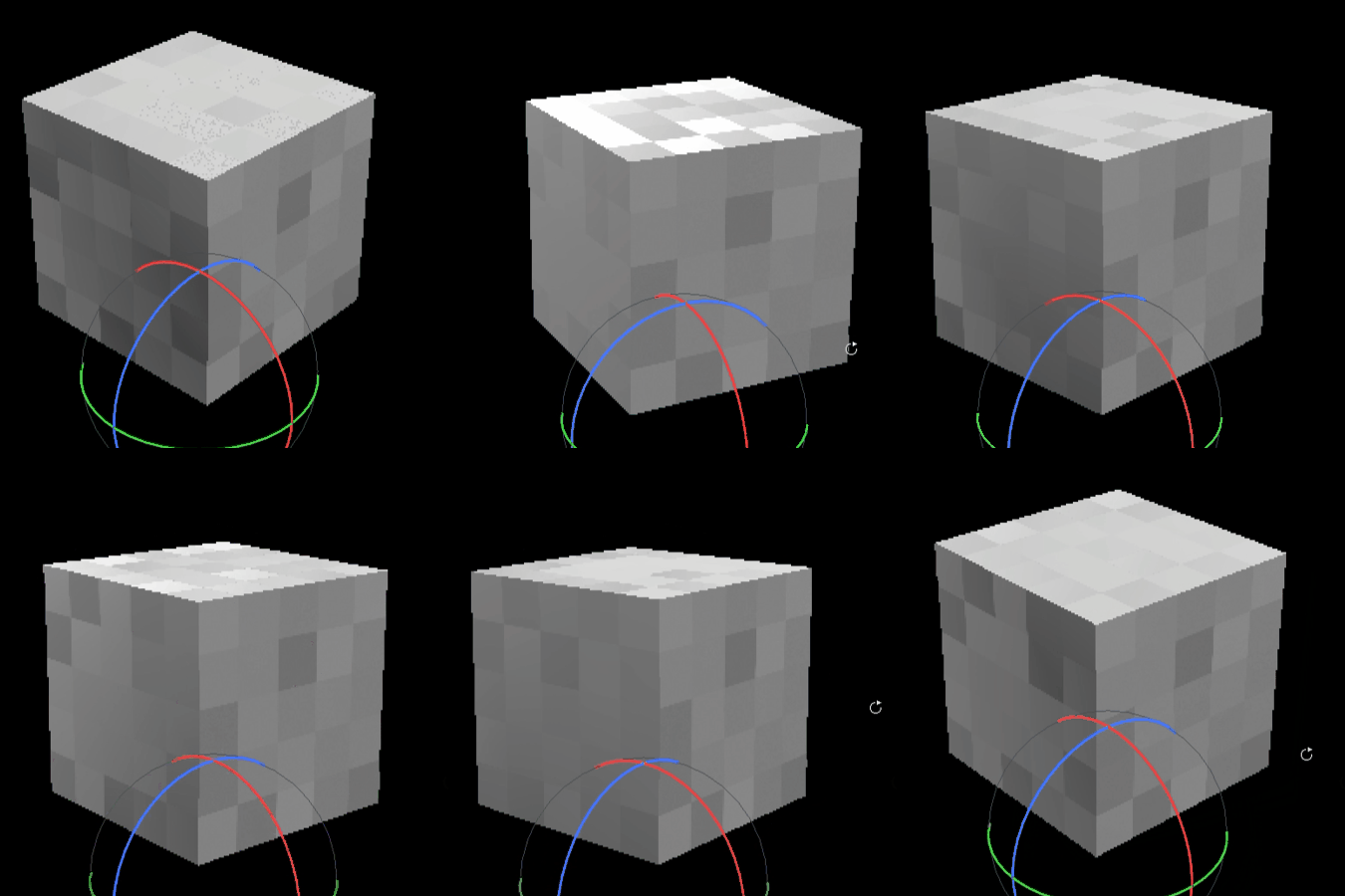
And here we are, a cube that has only six polygons, each with twenty-five squares facing different directions. Something like this would be a lot harder to try to replicate with actually modeled or sculpted detail.
For even more in-depth instructions check out the tutorial by Nick Lewis on Artstation’s Youtube page.
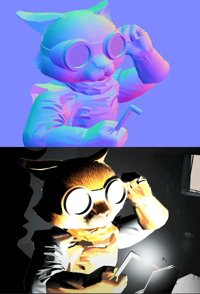
Nick Lewis: Hand-painting Normal Maps – Demo Cat

Written by David Macias
HYGGE IT OUT: THE LOOK OF LOAM

Written by Shelby Vecchio
The look of Loam was cultivated by our team entirely remotely. We started putting together Loam a little after the pandemic hit. Our first brainstorming sessions were over Zoom, which set the precedence for how the creation of this game would go. Developing the art direction of the game was no exception.
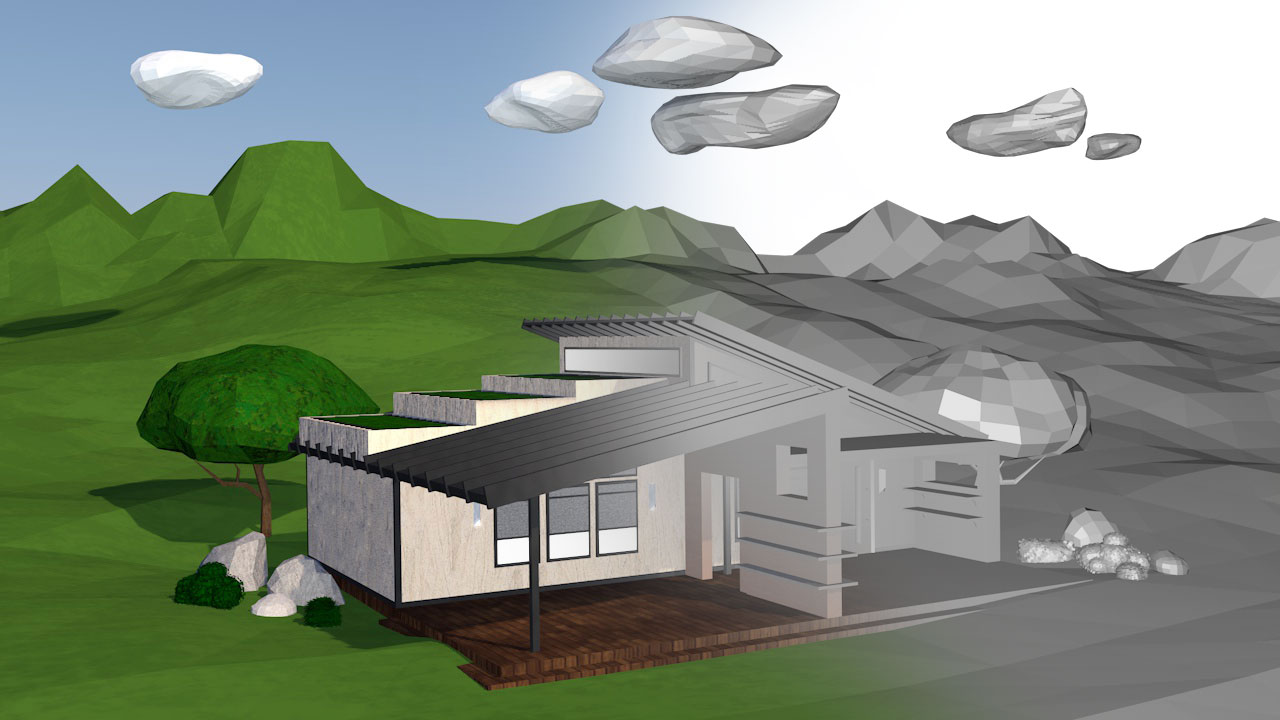

A lot of solo work had to be done since we were all quarantined for almost all of 2020. A lot of research and discovery had to be done on paper, video calls, digital presentations, and virtual demos. For a Virtual Reality (VR) game, this seemed possible as we were able to come up with a system to all be able to test and work together remotely.
Loam began with an idea, some goals for the intention of the game, and a loosely defined genre. We knew it would mainly focus on gardening outdoors, be a peaceful escape, with little conflicts in gameplay. As the story started to evolve into what we know as Loam, the intention of the game became clearer. Some themes became apparent for the visual direction:
– Tranquility
– Simplicity
– Isolation
– Visually dynamic
– Natural
– Tactile
– Task orientated
Background of the Art Style
After establishing the setup and themes for Loam, the research began on places on Earth we could emulate in VR. Setting up the scene would help inform what aspects needed to be addressed and the importance of the environmental assets in order to set up the context of the world.
Prioritizing the themes of tranquility, visually dynamic, and isolation: we defined the environment to be set in a mountainous valley landscape. It was inspired by Nordic European mountain valleys, all while taking pieces of inspiration from the American West and Mediterranean mountainous landscapes.
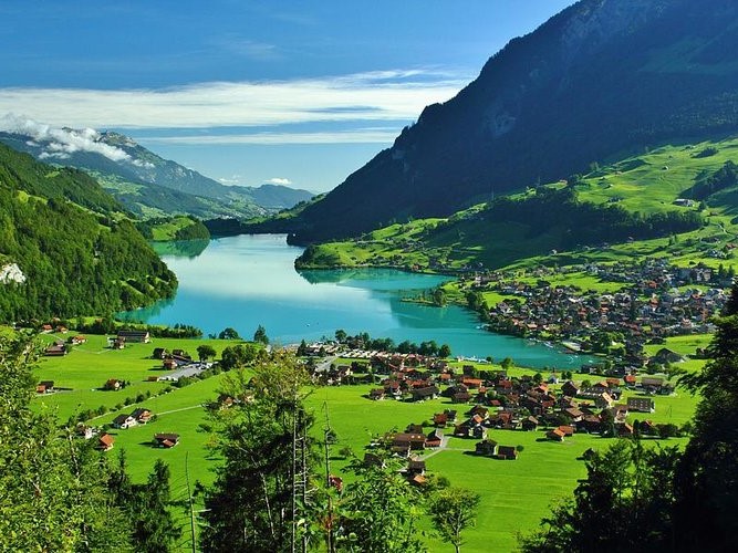
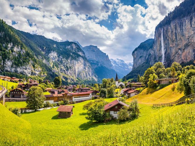
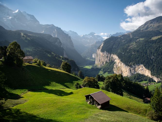
Knowing the game’s setting, we knew that objects had to be created in a wide range of scale. So whatever treatment worked for a tool should be applicable to a mountain. The game would contain a large volume of items, so I wanted to keep a consistent visual language since we were dealing with a ton of assets. The more definitive the look, the less we could contemplate the treatment of the design for each item or effect.
From these themes, the tone of the art style was loosely defined:
Bright, cheery, cozy within the valley, yet vast in the distance, hopeful and optimistic.
Asset Structure
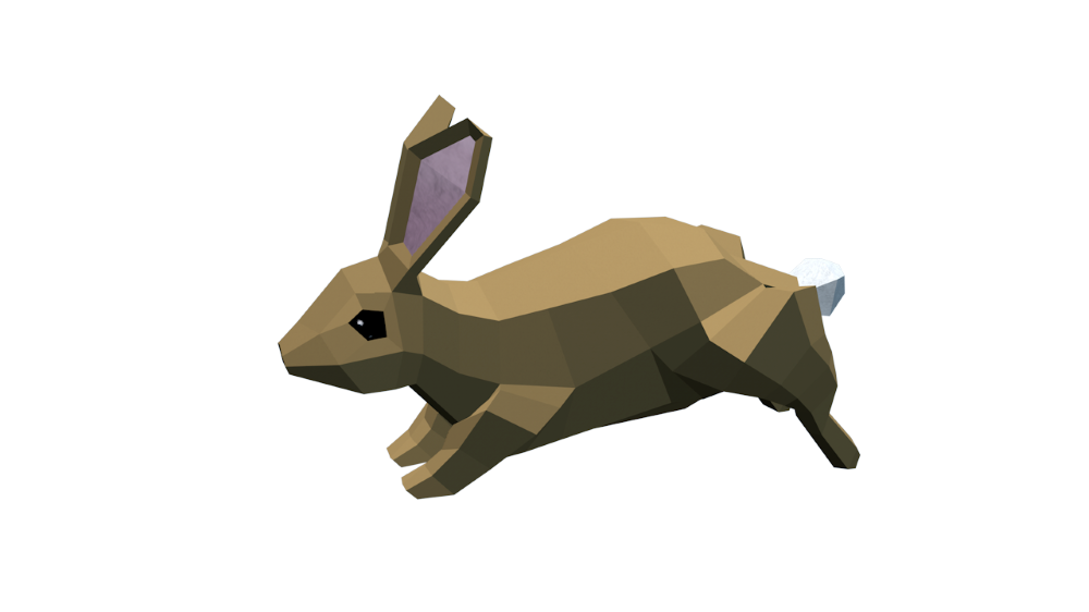
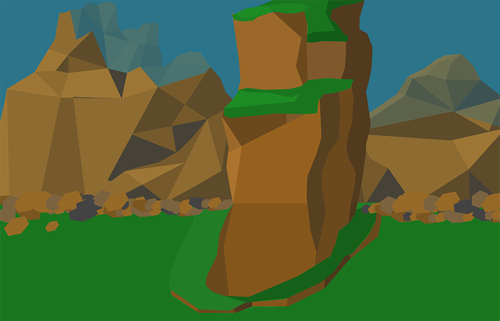
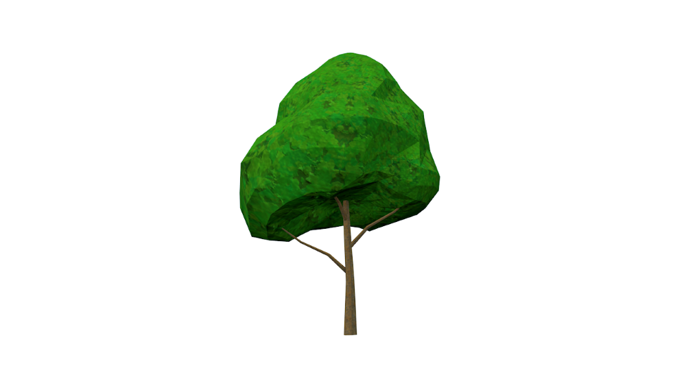
As I dug into different model looks, with the curated guideline above, low poly seemed like a smart move. Not only does it save computing power, but it would give us a little more freedom in transforming real-world elements into a virtual space since we do not have to conform to realism. When you picture “low poly,” the mind tends to wander to those beautiful sharp triangular shapes you can find when executed well in many games and renderings. But with Loam, we wanted to push the continuity even further and try something a little different.


The objective of the style was to create a peaceful and tranquil set up, so as you are playing the game, the visuals would not cause a sense of overwhelm but a sense of calm. This was accomplished by using a visual of a quilt, which in the physical world has a connotation of warmth and comfort, as the structure of all the elements you will see in the game. There may be some sharp angles for context, but overall, everything should be following a sense of “blanket” in shape. Hence why you will only see mainly quads within the game.
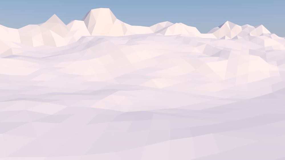

Understanding the scope of the environment means I set up a custom landscape from physical world inspiration and had to design the tools and items the user would be interacting with. Since I was digging into industrial design and a little bit of architectural design, I began research with the setting in which it was inspired, northern European. With its popularity, it was easy to find and understand the appeal: Scandinavian design.
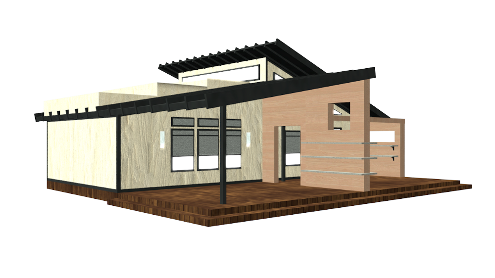
This further informed the structure of tools. Minimal in detail, highly geometric, and aesthetically contemporary. We also sourced inspiration from midcentury modern machines and household appliances. The mid-century look is very thoughtful in aesthetics, bold in shape and texture choices. Many items designed in this aesthetic have tactile, chunky operating systems, which complements the mechanics in a VR immersive experience. The more intentional the buttons and interactables, the faster the player can learn how to work a tool in VR. Midcentury modern also compliments the Scandinavian design quite nicely as they share some of the same design practices.
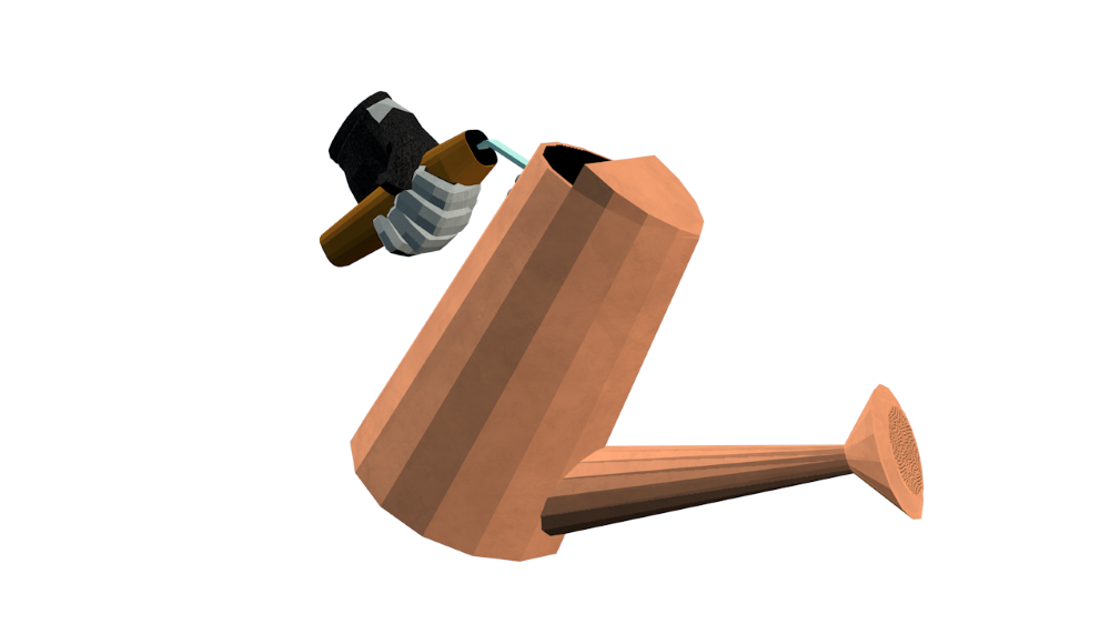
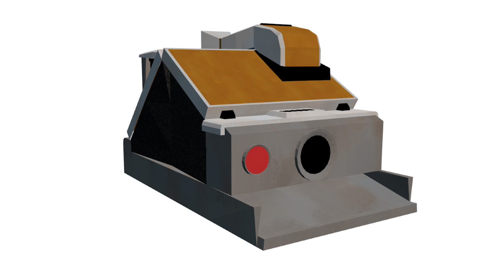
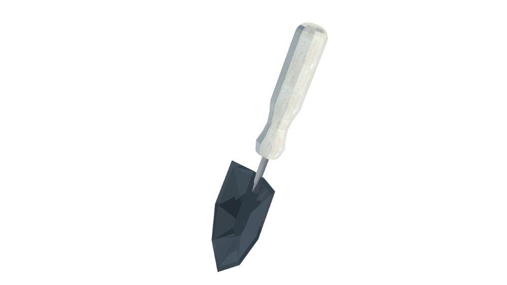
Having dug into the Nordic and Scandinavian design, another term kept popping up. It was something I was aware of but never had the language to define. It was a popular trend a few years ago, but you could say boutique home good stores have it still going strong today. The term seemed to fit effortlessly, so I added it as a main theme to the design language of Loam:
hyg·ge (noun) /ˈh(y)o͞oɡə,ˈho͝oɡə/
Merriam-Webster defines hygge as “a cozy quality that makes a person feel content and comfortable.”
Using hygge as guidance this ties in with the Nordic environment inspiration and the quilt aesthetic. This kind of design relies on natural materials, which fits within the context of the game. The player resides in a mountain valley, isolated from the outside world. This means they would only have their hands on the materials around them.
Digging a Little Deeper
Textures
Due to the context of the game, we knew most of the art would be influenced by the physical and natural world. Although it could be said the natural world contains a lot of symmetry, it also includes a lot of chaos and fluidity. It made sense for us to create custom textures. No templates, no structure, just organic patterns. Almost all the textures within the game are digitally painted.
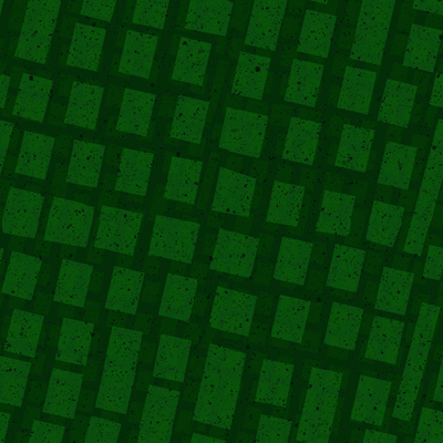
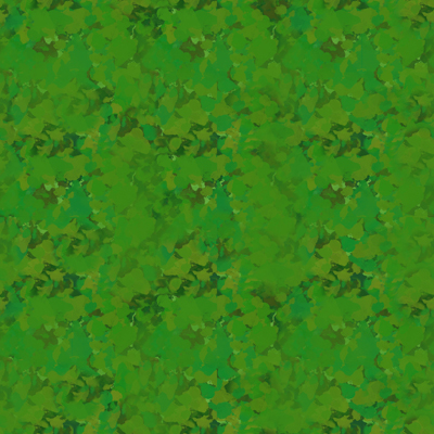

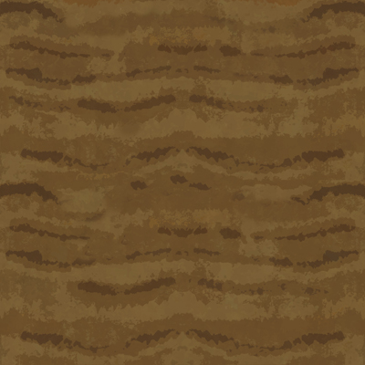

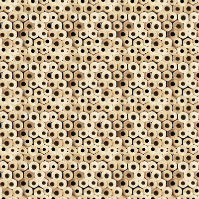
We worked with a digital illustrator who cultivated each texture for the entire environment. Following a natural pallet, rich in color tone but subtle in the usage, our texturing had a direction. Natural, raw materials, and jewel tones. Lighter building materials and vibrant plants.
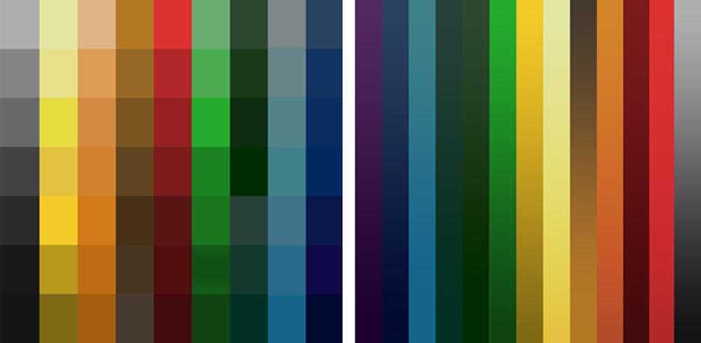
Lighting
One of the main objectives of Loam is to create your own garden however you see fit. We looked to our physical world again for inspiration. Light is essential for gardening in the real world, of course, depending on the plant for how much light is necessary. This establishes the importance of light. Using the vibrant color tone parameter, there are four distinct points of the day with their own color gradient. The sky follows this color pattern for each point of the day, and the coloring of the elements adjust accordingly. Shadows can be seen like real-world occlusions that would happen with their surroundings.
Effects
There is no exception to this aspect of the environment. Keeping the consistent art language means there is a sense of quads to effects while maintaining the roughness of the textures when applicable. We are still in development for these effects, so stay tuned to see them in Loam!
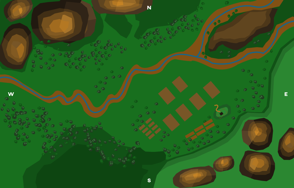
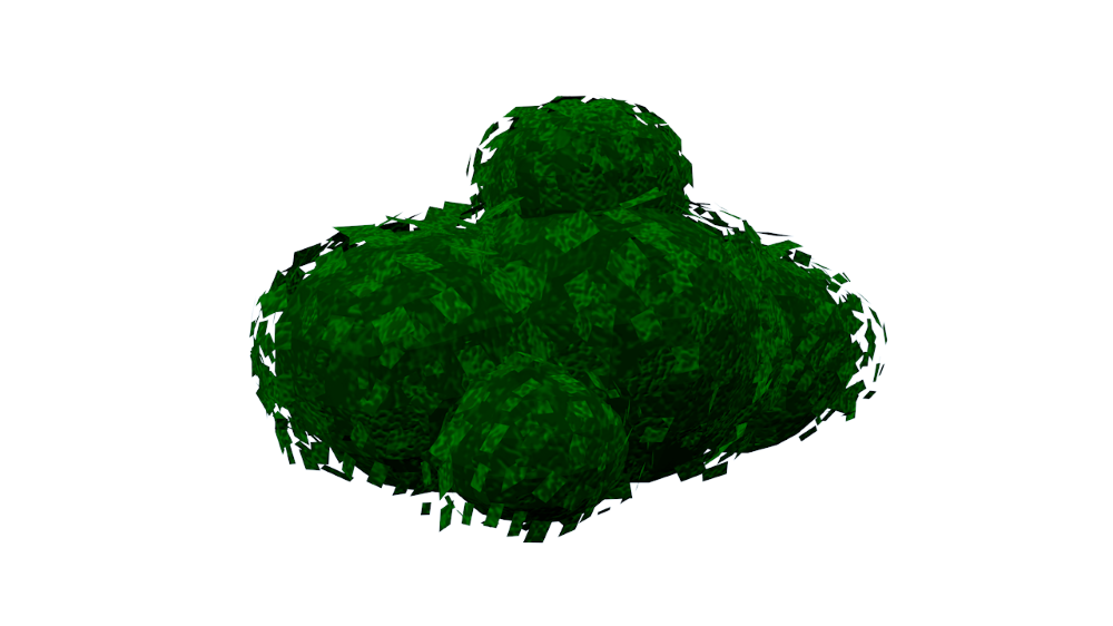
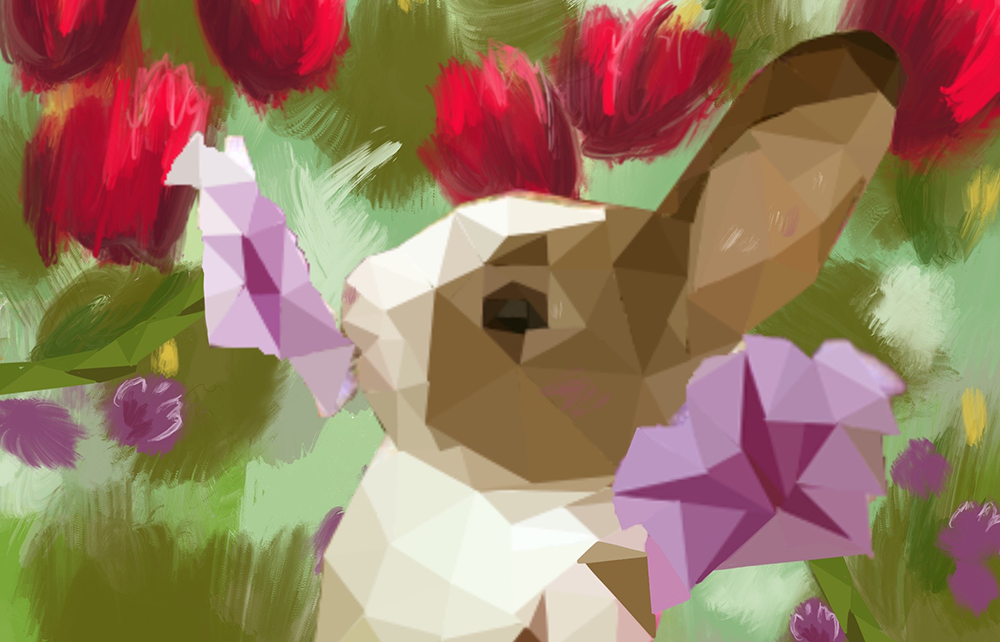
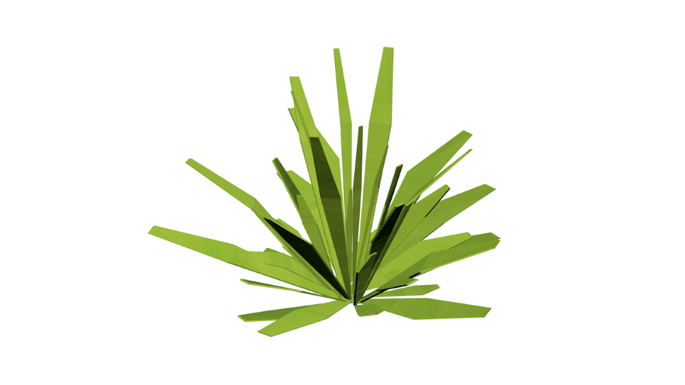
Hygge it Out
Now the art direction was really shaping up. It evolved into the following visual language:
Following the tone of a hygge sense of environment, loosely based on Scandinavian industrial design, minimal geometry, rustic and natural textures, all with low poly quadratic skins.
We concluded to follow these general guidelines as we set up the environment.
- Season motive: Spring/Summer, flowers in bloom, trees filled out.
- Design motives: Sophisticated, seasoned, soft cubism, detailed/tactile textures.
- Color motives: Deep hues, low/high saturation.
- General setting elements: Set within mountain valley, dense forests in the background, plain forests.
I hope you get to enjoy the world of Loam as we planted the seeds to cultivate something beautiful!
Art Team:
Art Director – Shelby Vecchio
Modeler/Tech Art – David Macias
Digital Illustrator – Shelby Brown

Written by Shelby Vecchio
DESIGNING FOR VR: HOW 2D AND 3D DESIGN DIFFER

Written by Shelby Vecchio
Ever wonder how art elements are designed for a virtual reality (VR) experience? At first glance, it may seem impressively difficult, but the process is quite straightforward. The trick is to design the components to be believable within the context of the experience and within the constraints of the system they run on. As experiences become more robust and diverse, the need for different kinds of art assets is important to set an immersive experience. On a very general level, we will talk about the basic types of art assets: two-dimensional and three-dimensional assets.
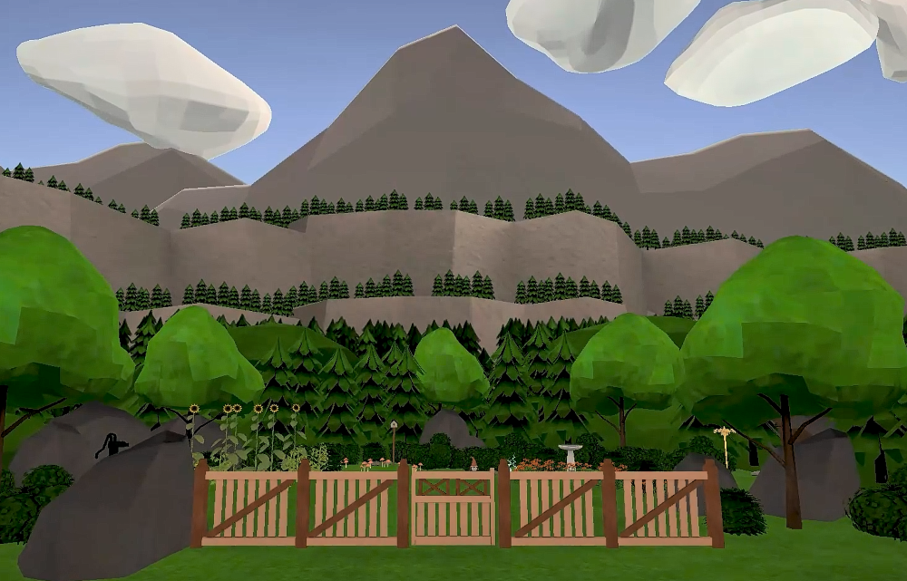
PROCESS
On a personal note, I have worked in a wide range of mediums. My training began in fine art, to graphic design, then 3D design, motion graphics, and finally to VR. Each medium has its own set of standards for output but understanding the elements and principles of design is a great foundation to start with. These themes can be translated into any medium. They can be used to your advantage or be broken to compliment the composition. That’s the great ideology of design; there is no one formula for success.
From my experience, every successful creative process begins with understanding the outcome. I narrowed down three questions to start the process:
1. Which platform the product will live on
2. Its purpose
3. The viewers that will consume it
Since we are focusing on VR, I will speak specifically to this medium. Once these parameters are defined, the virtual world’s creation or elements will begin to come into fruition efficiently. VR is mainly viewed from a headset that obscures your surroundings, so it is quite exciting for a creative to have full reign on what the viewer is seeing.
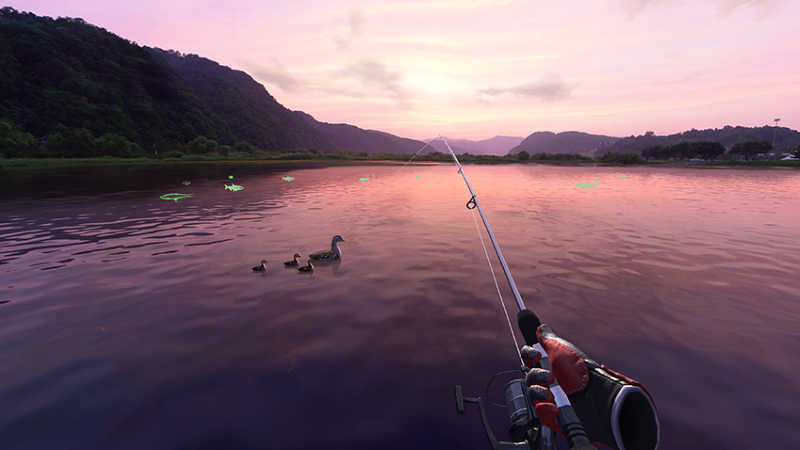
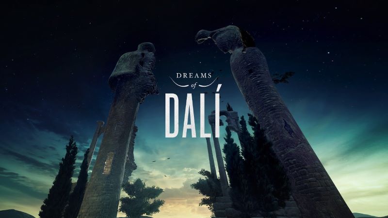
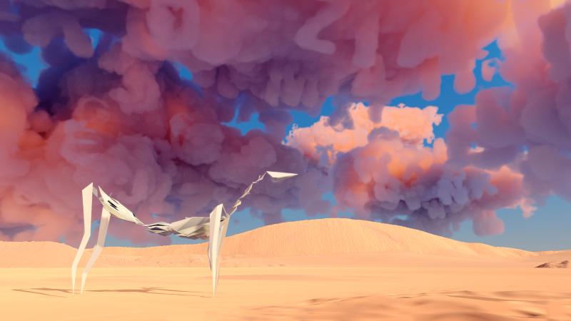
The experience’s context will drive the asset’s art direction, whether it’s set in a “realistic” world or a fantastical setting. Are the assets following real-world objects, or are they alien to our experience? These are more specific questions to the basis of any design, but in VR, the person in the headset could be taken to another sensory level. The assets can sometimes set the standard of the look, feel, and occasionally inform the world’s physics.
2D/3D
The process of designing art elements to fit within an immersive experience varies. Since we are focusing on the fundamentals of a virtual art setup, it will depend on whether they 2D or 3D art assets. They contain similarities and differences in workflow and output. Let’s talk about the differences between designing in 2D and 3D for VR.
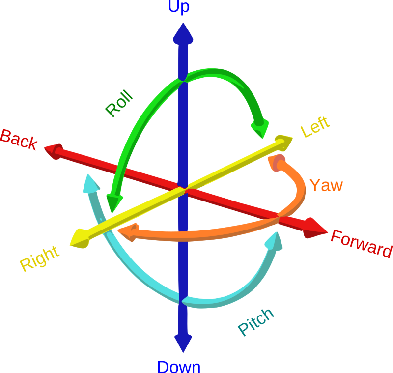
2D and 3D are just plane different. That is in the plane you perceive an object from. 2D objects exist from a flat plane, meaning they live in the X and Y on a coordinate system. 3D objects exist in three-dimension space or a three-coordinate plane system: X, Y, and Z. Being in VR, these assets will most likely exist in a 6DoF environment. This means there are 6 degrees of freedom they could potentially live in. Take the three-dimensional coordinate system, and then move it forward, backward, up, and down.
Testing art assets is essential. Viewing 2D or 3D assets on a computer is not accurate as to what they will look like in the headset; since VR is more often in DoF, seeing them in the VR setup is very beneficial.
It is also important to keep the assets as efficient as the system that can handle them. A scene with a large number of items takes a very long time to load. Briefly, here are some optimization points you can use when developing art assets. Grouping items into a singular mesh, lowering polycount, relying on textures for some details, knowing when a model or texture is necessary, and utilizing programmatic effects will all help you create a more effective library of content. Worth looking into these optimization points if they sound beneficial, but for this blog, since we speak to 2D and 3D elements specifically, let’s break down some do’s and don’ts to help for a faster and more effective workflow output to VR.
DESIGNING IN 2D FOR VR
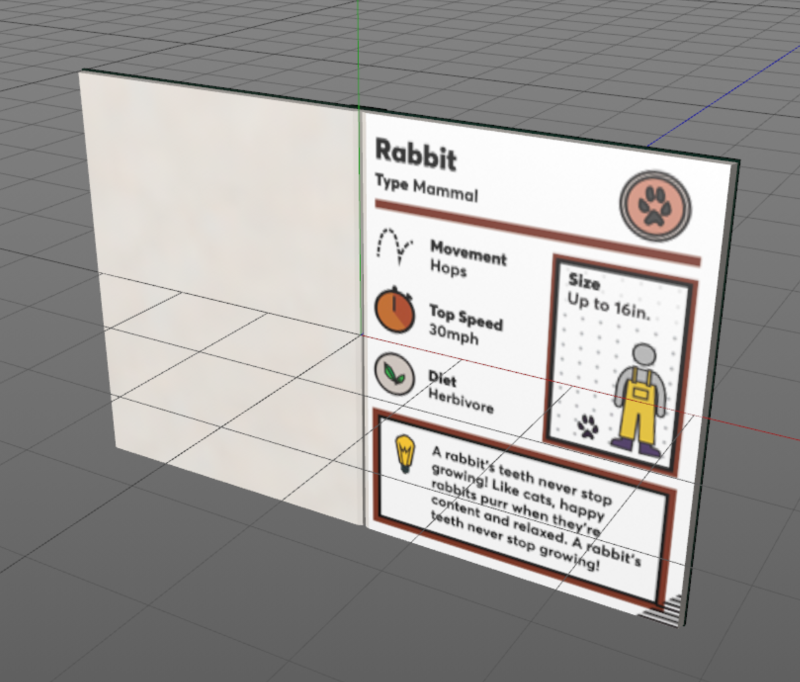
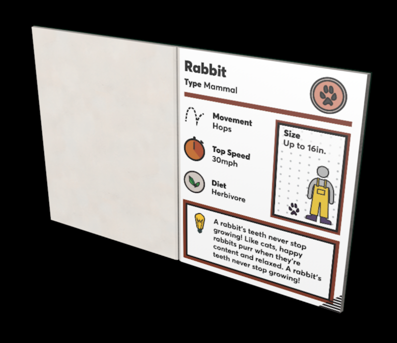
Legibility is essential for design composition. Being in VR can somewhat be disorientating, so registering a 2D design takes a little more brainpower. As a designer, it is my goal to keep the design as simple and legible as possible. These are some points I have learned in the process of inputting 2D elements into a VR space.
LESSONS LEARNED:
The larger the font, the easier it is for more people to read.
Everyone has a different capacity of eyesight, but it is best to design with the criteria that most will have trouble seeing text in the headset. This means exaggerating the size of the text in a composition. Although it may appear text on a 2D plane will be close to a 150% zoom, in VR, it will appear a quarter of that.
Go bold or go home.
The bolder font doesn’t necessarily mean make all the font-weight black. It means the thicker the line weight, the more legible and less aliasing in VR. Thin-weighted font can appear to alias if not directly in the viewer’s point of view.
Understand the headsets DPI.
Some headsets have a higher pixel count than others, so this means more detail can be perceived. The human eye can only discern to a certain amount, so anything higher in resolution will just be a waste of space.
The simpler the easier to digest.
Of course, the design’s complexity varies depending on the context, but less text, in general, is always a user-friendly option. Reading in VR could get dizzying. Probably better to leave complex material out of the headset.
Testing is your new middle name.
Testing is essential for delivering VR ready 2D assets. The elements will look fundamentally different on your 2D screen than they look in VR.
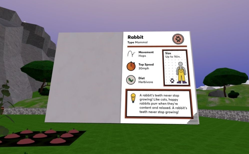
As you are creating 2D assets for a VR experience, keep these guidelines in mind. They are not meant to be roadblocks but tools to use to make the design translate as intended from your 2D plane to a 6DoF world.
DESIGNING IN 3D FOR VR
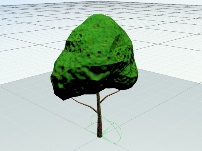
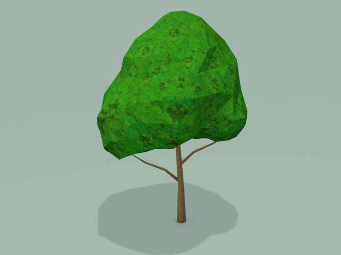
This is a medium that involves total immersion. The viewer is immersed in an alternate reality, which can sometimes have ties to the physical natural world. Therefore, industrial design is a major part of developing 3D assets for VR. These are some points I have learned in the process of inputting 3D elements into a VR space.
LESSONS LEARNED:
Understanding the physical will inform the virtual.
In some cases, 3D design for VR is closer to industrial design than the typical 3D art. Of course, it all depends on the intention and the amount of interactivity the player will have with the 3D object. If an object will interact majorly, it is essential to design with the physics at the forefront. For example, if you understand how a doorknob works in real life, you can use that perception from your experience to make a usable 3D doorknob for VR. Some 3D assets are not interactable, so that the appearance will drive the design more than the usability. This could include background/scene setup, which is mainly there to stage an environment.
Look at it from all angles.
Yes, look at it from all angles. ALL of them. This object could exist in 6 degrees of freedom. That means if it exists in the natural world, it is important to look at the 3D object from every angle.
Just because it needs to look 3D doesn’t mean it has to be 3D.
This may be the case for other mediums, but it is also the case for VR. Easier to take advantage of the eye with 3D. You can register objects from far away as dimensional objects in the right setup that were 2D objects. In VR, you may or may not see 3D assets at all angles, especially objects farther away. This can be an optimization opportunity.
Scale it accordingly.
It may seem like a simple parameter, but it is essential. You can always rely on the 3D software’s scale setup, but sometimes there is a grey area of whether something feels sized “right” in VR.
Testing must be brought up twice.
Just like with 2D assets, viewing your creations in VR will be the only opportunity to understand how it fully translates.
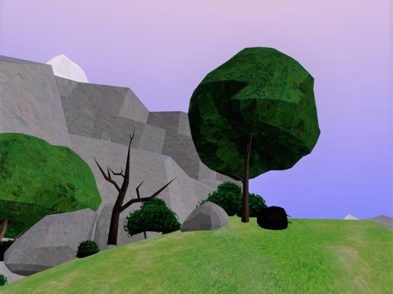
3D design is a great tool to use to set up an environment for an immersive experience. Like with the 2D guidelines, these can be seen more to enhance your composition, not to roadblock it.
IMPORTANCE OF DESIGN WITHIN VR
The art and physics of an immersive experience go hand in hand. Design assets that follow real-world conventions should be designed to follow real-world physics. And real-world physics programmed in VR can be made to be believable with masterfully designed interactable objects.
Although it is important to have parameters when establishing a creative direction, I have learned they should not be used as barriers. VR is an evolving tool, so there are always workarounds or solutions. Sometimes your tests will not always match your initial intention. So, it’s ok to be fluid with your design approach and direction if it fulfills the experience’s outcome. The art of the experience will give the illusion of its believability. 2D/3D art design is an essential part of the VR development process.

Written by Shelby Vecchio
CREATING TEXTURES FOR VIRTUAL REALITY

Written by Shelby Marie Vaughn
Half the fun of being a multimedia artist is playing around with different media. While I love using a traditional medium like colored pencil, I’ve had a blast exploring the digital art space. At Amebous Labs, I’ve adapted my practices for virtual reality (VR). There are countless ways to make art for the medium, but I’d like to share two of my techniques for creating 2d textures for 3d models.


I like to take unconventional samples, so they are not immediately recognizable.
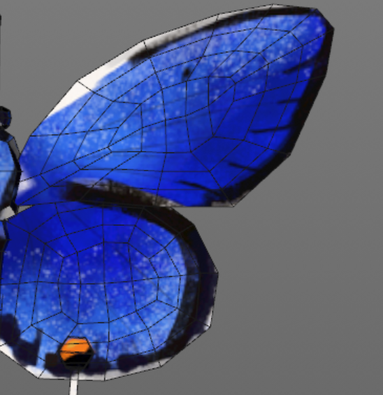
The first is a free-hand approach. This is most useful when I am creating a texture for something that has organic shapes or does not require tiling (repeating the design in multiple directions.) For example, I created the Eastern Tailed-Blue Butterfly’s main texture by hand in the app Procreate on my iPad. First, I grabbed a screenshot of the 3d model to have a general idea of where the elements I’m drawing will land when they are mapped on later.
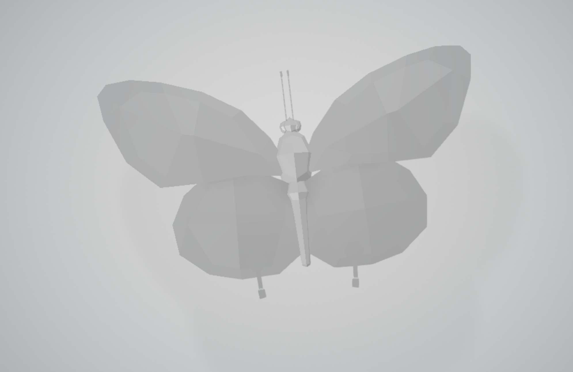
Once I’ve traced the important curves and edges, I begin digitally painting. Layers are your friend! This makes it easier to pass to another artist or make quick changes, rather than drawing all of the details on one layer.
When I am happy with the painting, I will export the layers as pngs to Photoshop. There I can clean up any details and send it to the modeler to assemble. Here is the finished look. What do you think?
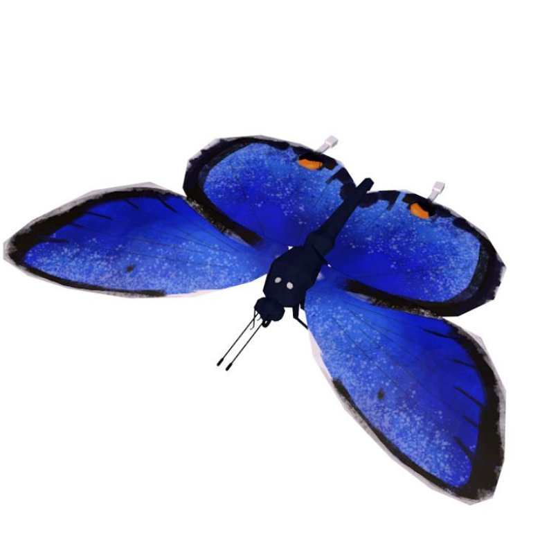
The second method I use is creating seamless designs. This method takes a little more technical skill and finesse but looks great when it works. Let’s take a leaf texture, for example. It is green, rough, and bumpy in parts, but not quite as unique as a butterfly. In this example, I took a picture of my patio and combine it with our illustration style to create a new design. There are free texture databases online to help build your collection. I like to take unconventional samples, so they are not immediately recognizable.
Next, I add the Photoshop cutout filter to make it look more like an artsy pattern than gravel. Then, I’ll add a few more art layers or textures until I am happy with the shape. When I have a good base, the next step is to add the hue or a color that makes sense for the object. In this case, I add a few greens. Be sure to play with the opacity settings to see the different effects you can get with the same image. Before I export, I make the design seamless. To do that I take each patterned layer and apply the offset filter so that the outer edges are flipped inwards. To make sure the seams are wrapped to the center, I push the canvas horizontally and vertically, half of its size. Then I take the stamp tool and clean up the seams. You can also check your seams online with this helpful website; it is a great tool to make sure your pattern repeats naturally.
When you’ve cleaned up the seams, you end up with a pattern that can be tiled on 3d surfaces beautifully. Some models use a combination of the two methods I described. Our sunflower has a seamless leaf and stem textures with hand-painted seed and petal textures.
