GNOME DOMAIN IN TILT BRUSH

Written by Shelby Vecchio
Game art is a valuable tool in creating immersive in-game worlds. It is so much more than a set of visuals—game art assumes the premier role in establishing a story’s environment and industrial design. It is the vital puzzle piece linking together strong user interfaces and interactive designs to create successful games.

Game art is more than just visuals, it establishes the environment and industrial design of the story.
As Loam’s art director, I not only set the visual standard and overall tone of the graphics, but I also contribute to the development of the game’s art. In doing so, I play a major role in defining the world of Loam. With help from a team of talented artists, we can shape the look and feel of the game. Sometimes, exploring environments and characters that won’t directly appear in-game is an excellent way of adding depth to the game’s world. Take Loam’s gnomes, for example. Have you ever wondered where they go to sleep?
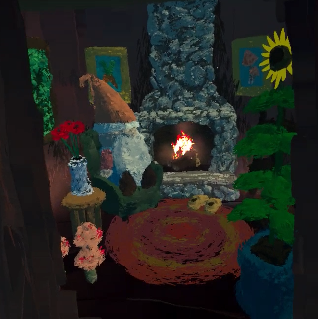
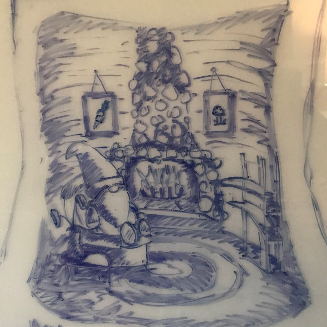
I’ve heard that homes can reveal tons of information about their owners’ characteristics, values, and personalities. Throughout the creation of this piece, I learned so much about the gnomes of Loam. After sketching out my initial ideas, I threw on a VR headset and took my curiosity to Tilt Brush to unveil what a gnome’s home looks like in Loam. The room’s snug, cozy ambiance shows me how much these little guys value comfort and relaxation and, considering their homes are located within trees and filled with floral decor, it is safe to say that Loam’s gnomes are deeply in touch with nature.
Watch the video below for a full time-lapse of this Tilt Brush gnome home creation!

Written by Shelby Vecchio
HYGGE IT OUT: THE LOOK OF LOAM

Written by Shelby Vecchio
The look of Loam was cultivated by our team entirely remotely. We started putting together Loam a little after the pandemic hit. Our first brainstorming sessions were over Zoom, which set the precedence for how the creation of this game would go. Developing the art direction of the game was no exception.

A lot of solo work had to be done since we were all quarantined for almost all of 2020. A lot of research and discovery had to be done on paper, video calls, digital presentations, and virtual demos. For a Virtual Reality (VR) game, this seemed possible as we were able to come up with a system to all be able to test and work together remotely.
Loam began with an idea, some goals for the intention of the game, and a loosely defined genre. We knew it would mainly focus on gardening outdoors, be a peaceful escape, with little conflicts in gameplay. As the story started to evolve into what we know as Loam, the intention of the game became clearer. Some themes became apparent for the visual direction:
– Tranquility
– Simplicity
– Isolation
– Visually dynamic
– Natural
– Tactile
– Task orientated
Background of the Art Style
After establishing the setup and themes for Loam, the research began on places on Earth we could emulate in VR. Setting up the scene would help inform what aspects needed to be addressed and the importance of the environmental assets in order to set up the context of the world.
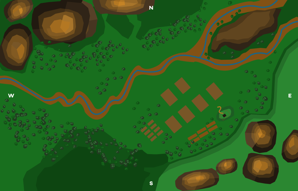
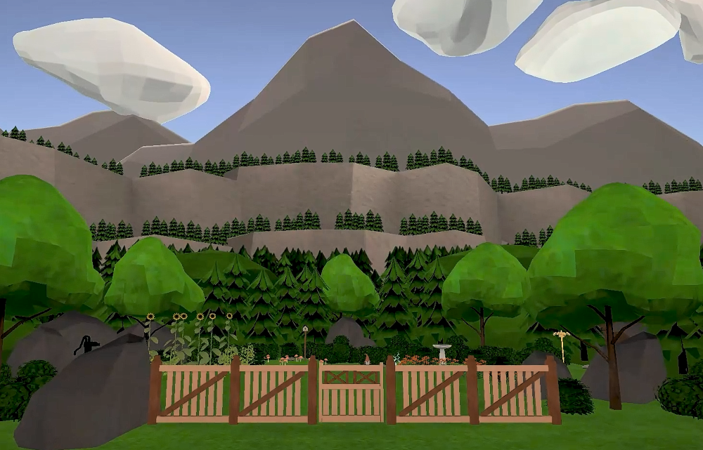
Prioritizing the themes of tranquility, visually dynamic, and isolation: we defined the environment to be set in a mountainous valley landscape. It was inspired by Nordic European mountain valleys, all while taking pieces of inspiration from the American West and Mediterranean mountainous landscapes.
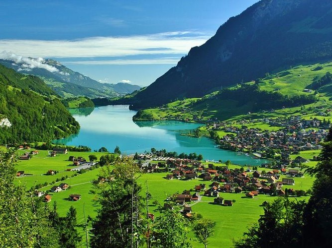
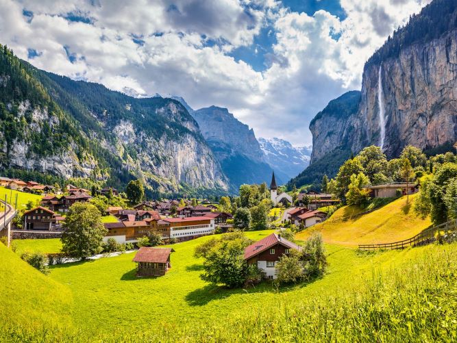
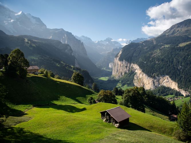
Knowing the game’s setting, we knew that objects had to be created in a wide range of scale. So whatever treatment worked for a tool should be applicable to a mountain. The game would contain a large volume of items, so I wanted to keep a consistent visual language since we were dealing with a ton of assets. The more definitive the look, the less we could contemplate the treatment of the design for each item or effect.
From these themes, the tone of the art style was loosely defined:
Bright, cheery, cozy within the valley, yet vast in the distance, hopeful and optimistic.
Asset Structure
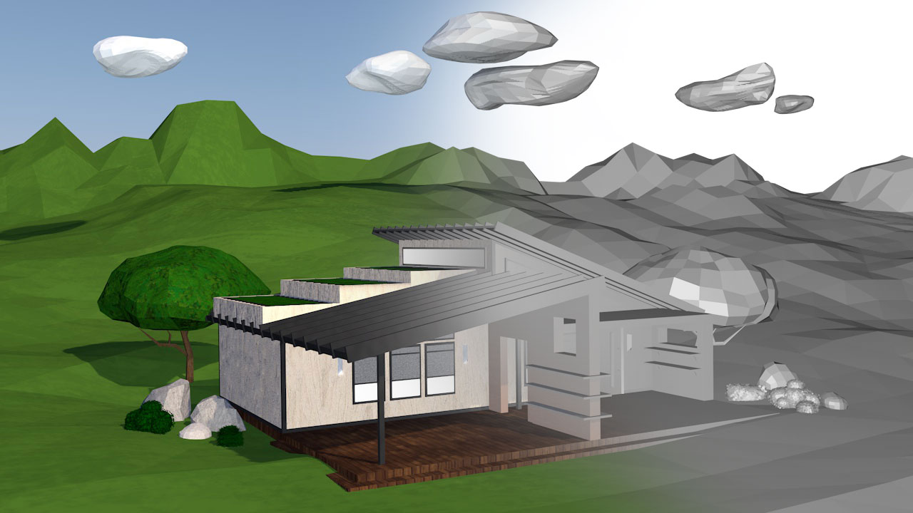
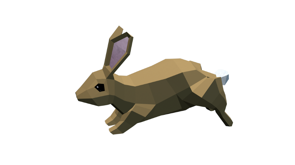
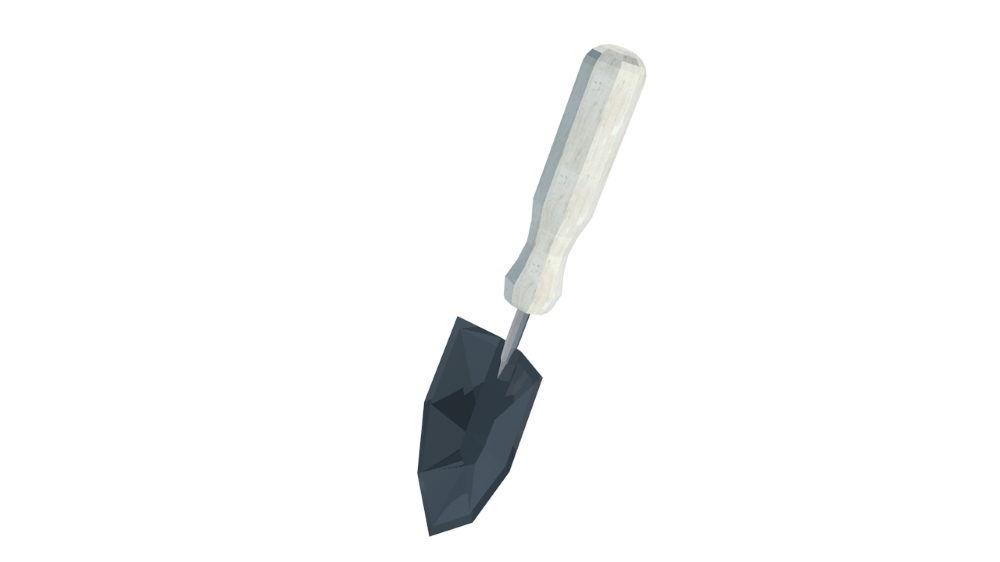
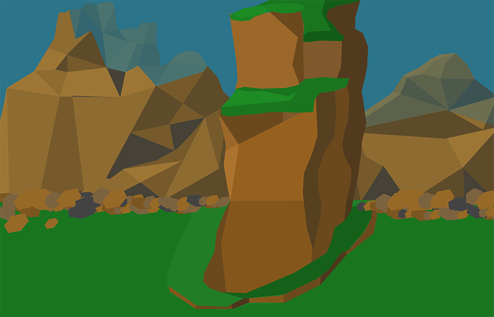
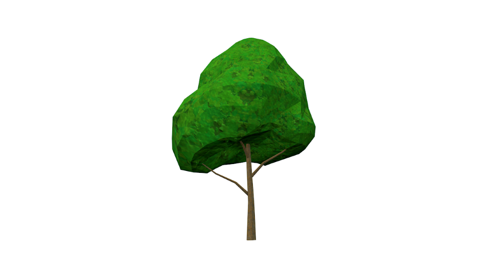
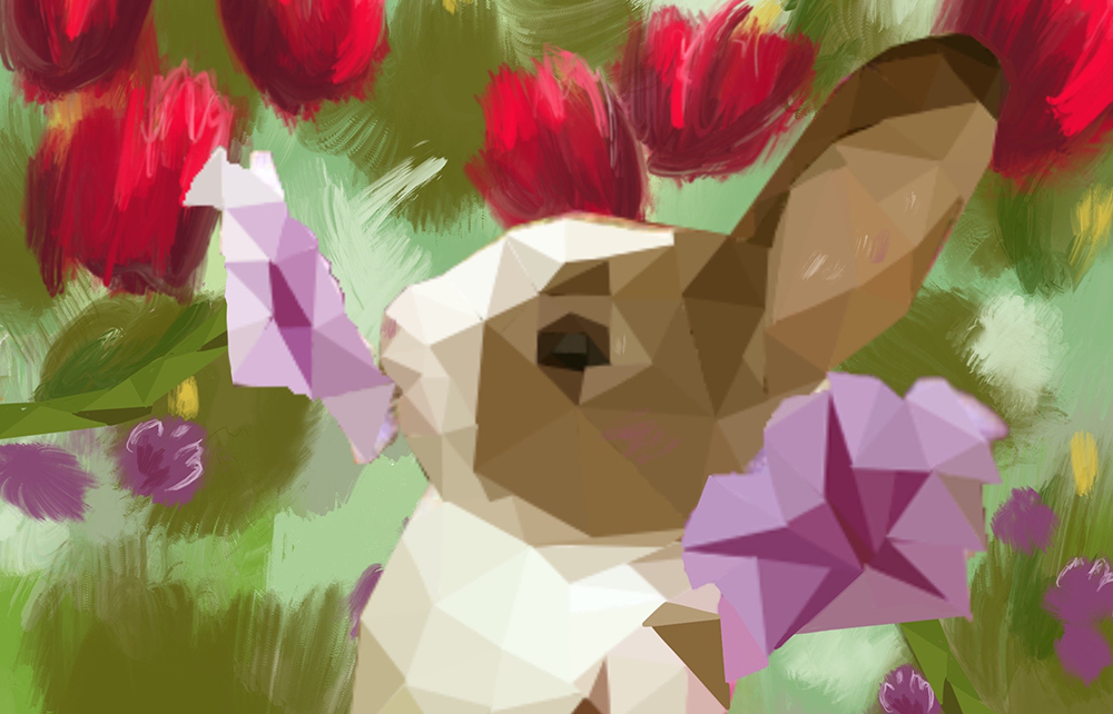
As I dug into different model looks, with the curated guideline above, low poly seemed like a smart move. Not only does it save computing power, but it would give us a little more freedom in transforming real-world elements into a virtual space since we do not have to conform to realism. When you picture “low poly,” the mind tends to wander to those beautiful sharp triangular shapes you can find when executed well in many games and renderings. But with Loam, we wanted to push the continuity even further and try something a little different.
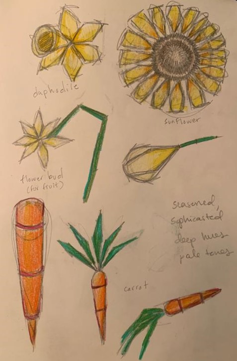
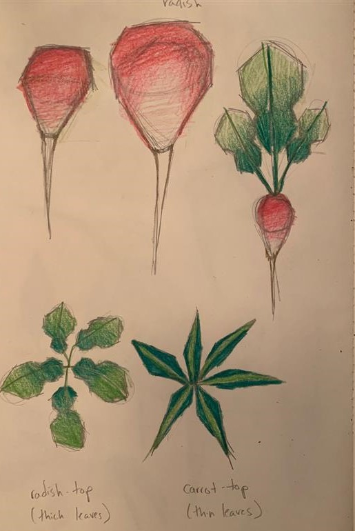
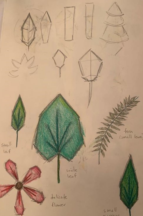
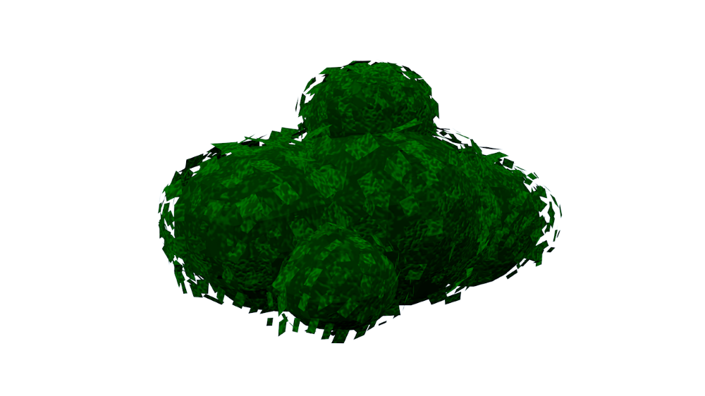
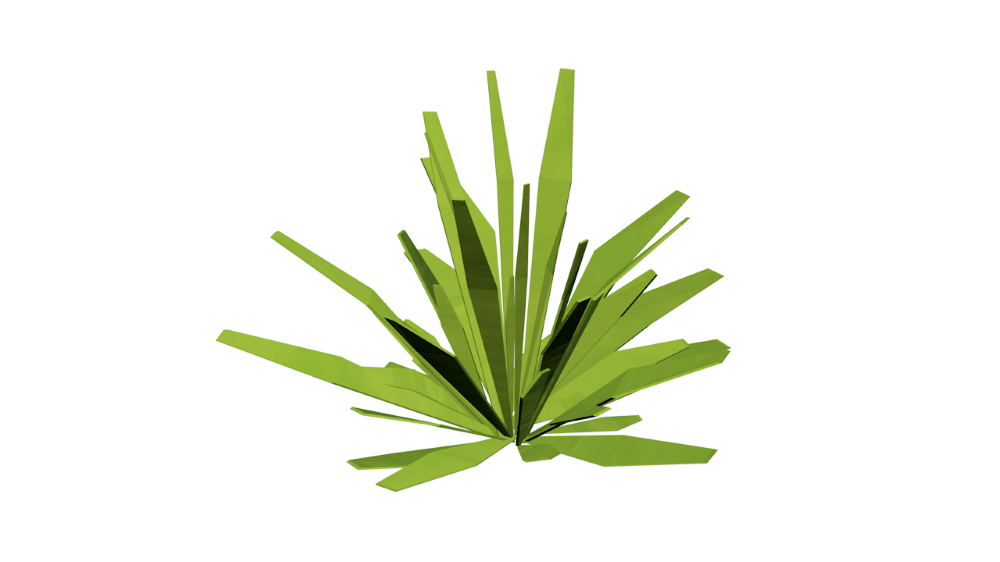
The objective of the style was to create a peaceful and tranquil set up, so as you are playing the game, the visuals would not cause a sense of overwhelm but a sense of calm. This was accomplished by using a visual of a quilt, which in the physical world has a connotation of warmth and comfort, as the structure of all the elements you will see in the game. There may be some sharp angles for context, but overall, everything should be following a sense of “blanket” in shape. Hence why you will only see mainly quads within the game.
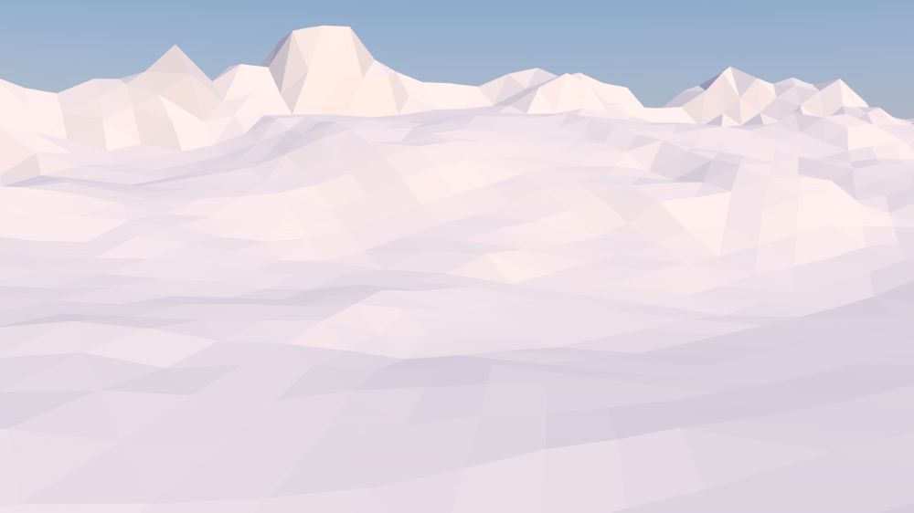
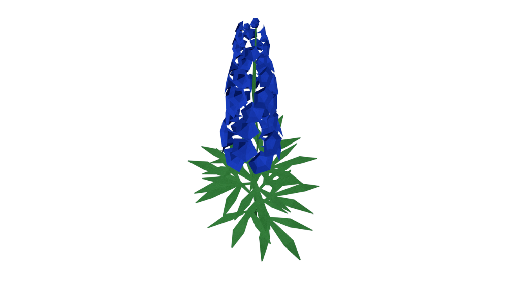
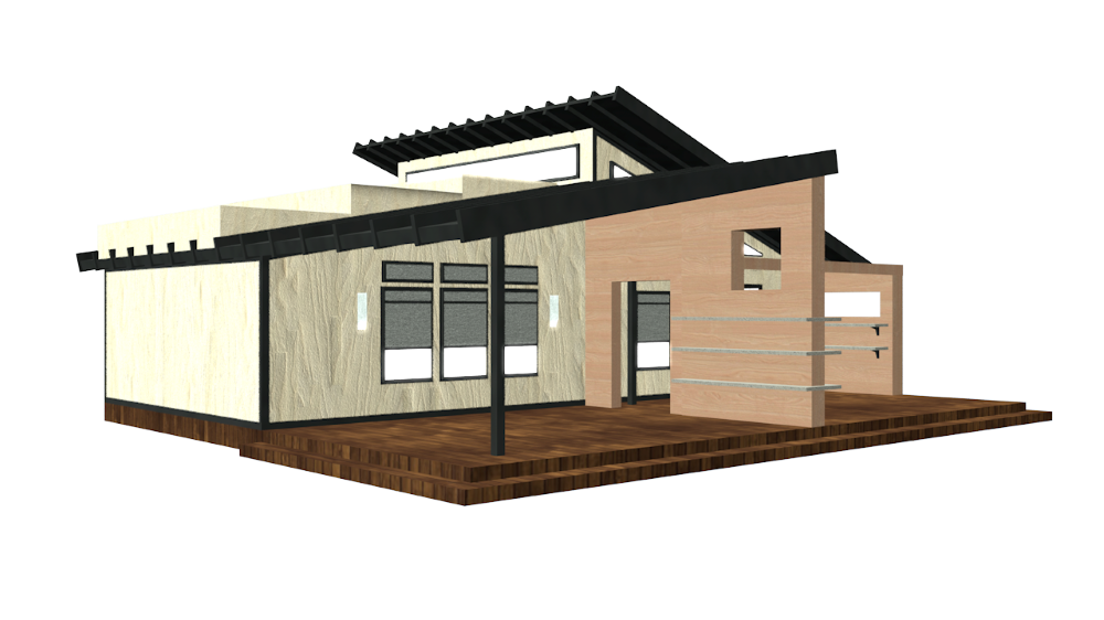
Understanding the scope of the environment means I set up a custom landscape from physical world inspiration and had to design the tools and items the user would be interacting with. Since I was digging into industrial design and a little bit of architectural design, I began research with the setting in which it was inspired, northern European. With its popularity, it was easy to find and understand the appeal: Scandinavian design.
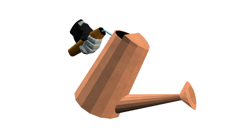
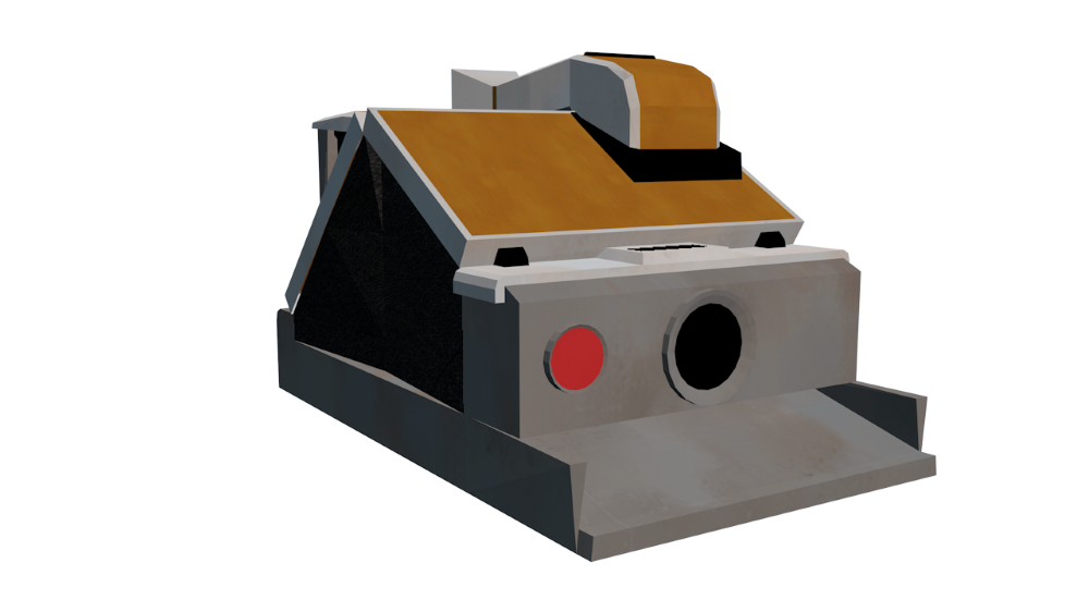
This further informed the structure of tools. Minimal in detail, highly geometric, and aesthetically contemporary. We also sourced inspiration from midcentury modern machines and household appliances. The mid-century look is very thoughtful in aesthetics, bold in shape and texture choices. Many items designed in this aesthetic have tactile, chunky operating systems, which complements the mechanics in a VR immersive experience. The more intentional the buttons and interactables, the faster the player can learn how to work a tool in VR. Midcentury modern also compliments the Scandinavian design quite nicely as they share some of the same design practices.
Having dug into the Nordic and Scandinavian design, another term kept popping up. It was something I was aware of but never had the language to define. It was a popular trend a few years ago, but you could say boutique home good stores have it still going strong today. The term seemed to fit effortlessly, so I added it as a main theme to the design language of Loam:
hyg·ge (noun) /ˈh(y)o͞oɡə,ˈho͝oɡə/
Merriam-Webster defines hygge as “a cozy quality that makes a person feel content and comfortable.”
Using hygge as guidance this ties in with the Nordic environment inspiration and the quilt aesthetic. This kind of design relies on natural materials, which fits within the context of the game. The player resides in a mountain valley, isolated from the outside world. This means they would only have their hands on the materials around them.
Digging a Little Deeper
Textures
Due to the context of the game, we knew most of the art would be influenced by the physical and natural world. Although it could be said the natural world contains a lot of symmetry, it also includes a lot of chaos and fluidity. It made sense for us to create custom textures. No templates, no structure, just organic patterns. Almost all the textures within the game are digitally painted.
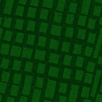
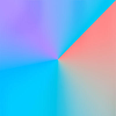
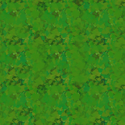
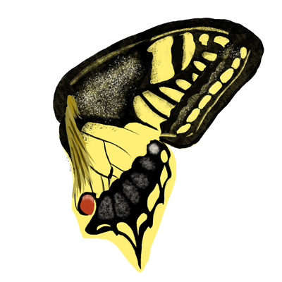
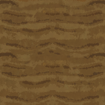
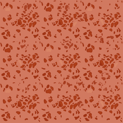
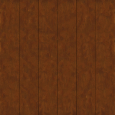
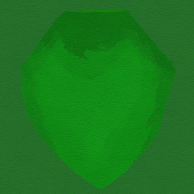
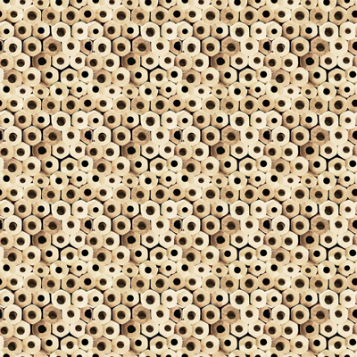
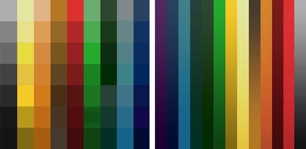
We worked with a digital illustrator who cultivated each texture for the entire environment. Following a natural pallet, rich in color tone but subtle in the usage, our texturing had a direction. Natural, raw materials, and jewel tones. Lighter building materials and vibrant plants.
Lighting
One of the main objectives of Loam is to create your own garden however you see fit. We looked to our physical world again for inspiration. Light is essential for gardening in the real world, of course, depending on the plant for how much light is necessary. This establishes the importance of light. Using the vibrant color tone parameter, there are four distinct points of the day with their own color gradient. The sky follows this color pattern for each point of the day, and the coloring of the elements adjust accordingly. Shadows can be seen like real-world occlusions that would happen with their surroundings.
Effects
There is no exception to this aspect of the environment. Keeping the consistent art language means there is a sense of quads to effects while maintaining the roughness of the textures when applicable. We are still in development for these effects, so stay tuned to see them in Loam!
Hygge it Out
Now the art direction was really shaping up. It evolved into the following visual language:
Following the tone of a hygge sense of environment, loosely based on Scandinavian industrial design, minimal geometry, rustic and natural textures, all with low poly quadratic skins.
We concluded to follow these general guidelines as we set up the environment.
- Season motive: Spring/Summer, flowers in bloom, trees filled out.
- Design motives: Sophisticated, seasoned, soft cubism, detailed/tactile textures.
- Color motives: Deep hues, low/high saturation.
- General setting elements: Set within mountain valley, dense forests in the background, plain forests.
I hope you get to enjoy the world of Loam as we planted the seeds to cultivate something beautiful!
Art Team:
Art Director – Shelby Vecchio
Modeler/Tech Art – David Macias
Digital Illustrator – Shelby Brown

Written by Shelby Vecchio
DESIGNING FOR VR: HOW 2D AND 3D DESIGN DIFFER

Written by Shelby Vecchio
Ever wonder how art elements are designed for a virtual reality (VR) experience? At first glance, it may seem impressively difficult, but the process is quite straightforward. The trick is to design the components to be believable within the context of the experience and within the constraints of the system they run on. As experiences become more robust and diverse, the need for different kinds of art assets is important to set an immersive experience. On a very general level, we will talk about the basic types of art assets: two-dimensional and three-dimensional assets.
PROCESS
On a personal note, I have worked in a wide range of mediums. My training began in fine art, to graphic design, then 3D design, motion graphics, and finally to VR. Each medium has its own set of standards for output but understanding the elements and principles of design is a great foundation to start with. These themes can be translated into any medium. They can be used to your advantage or be broken to compliment the composition. That’s the great ideology of design; there is no one formula for success.
From my experience, every successful creative process begins with understanding the outcome. I narrowed down three questions to start the process:
1. Which platform the product will live on
2. Its purpose
3. The viewers that will consume it
Since we are focusing on VR, I will speak specifically to this medium. Once these parameters are defined, the virtual world’s creation or elements will begin to come into fruition efficiently. VR is mainly viewed from a headset that obscures your surroundings, so it is quite exciting for a creative to have full reign on what the viewer is seeing.
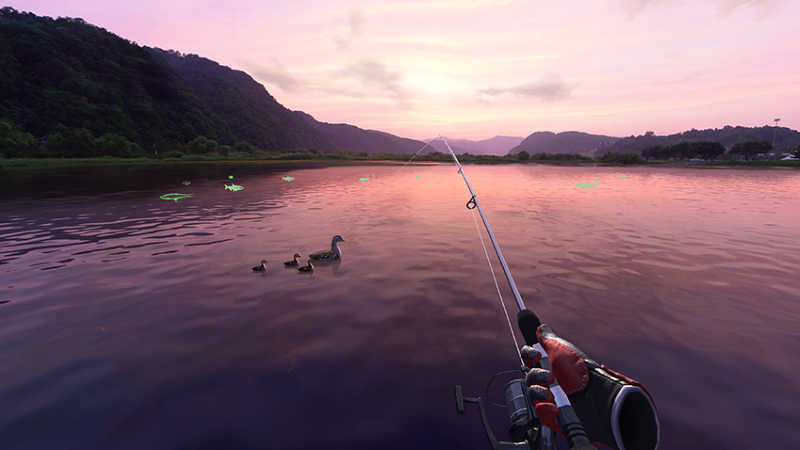
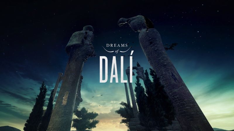
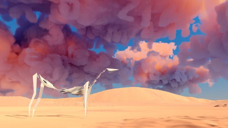
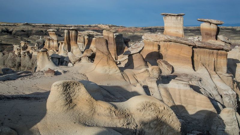
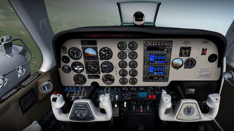
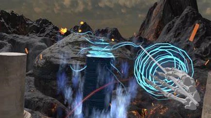
The experience’s context will drive the asset’s art direction, whether it’s set in a “realistic” world or a fantastical setting. Are the assets following real-world objects, or are they alien to our experience? These are more specific questions to the basis of any design, but in VR, the person in the headset could be taken to another sensory level. The assets can sometimes set the standard of the look, feel, and occasionally inform the world’s physics.
2D/3D
The process of designing art elements to fit within an immersive experience varies. Since we are focusing on the fundamentals of a virtual art setup, it will depend on whether they 2D or 3D art assets. They contain similarities and differences in workflow and output. Let’s talk about the differences between designing in 2D and 3D for VR.
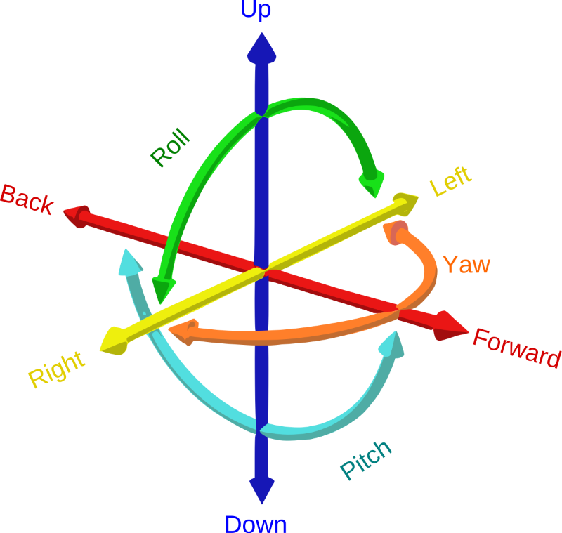
2D and 3D are just plane different. That is in the plane you perceive an object from. 2D objects exist from a flat plane, meaning they live in the X and Y on a coordinate system. 3D objects exist in three-dimension space or a three-coordinate plane system: X, Y, and Z. Being in VR, these assets will most likely exist in a 6DoF environment. This means there are 6 degrees of freedom they could potentially live in. Take the three-dimensional coordinate system, and then move it forward, backward, up, and down.
Testing art assets is essential. Viewing 2D or 3D assets on a computer is not accurate as to what they will look like in the headset; since VR is more often in DoF, seeing them in the VR setup is very beneficial.
It is also important to keep the assets as efficient as the system that can handle them. A scene with a large number of items takes a very long time to load. Briefly, here are some optimization points you can use when developing art assets. Grouping items into a singular mesh, lowering polycount, relying on textures for some details, knowing when a model or texture is necessary, and utilizing programmatic effects will all help you create a more effective library of content. Worth looking into these optimization points if they sound beneficial, but for this blog, since we speak to 2D and 3D elements specifically, let’s break down some do’s and don’ts to help for a faster and more effective workflow output to VR.
DESIGNING IN 2D FOR VR
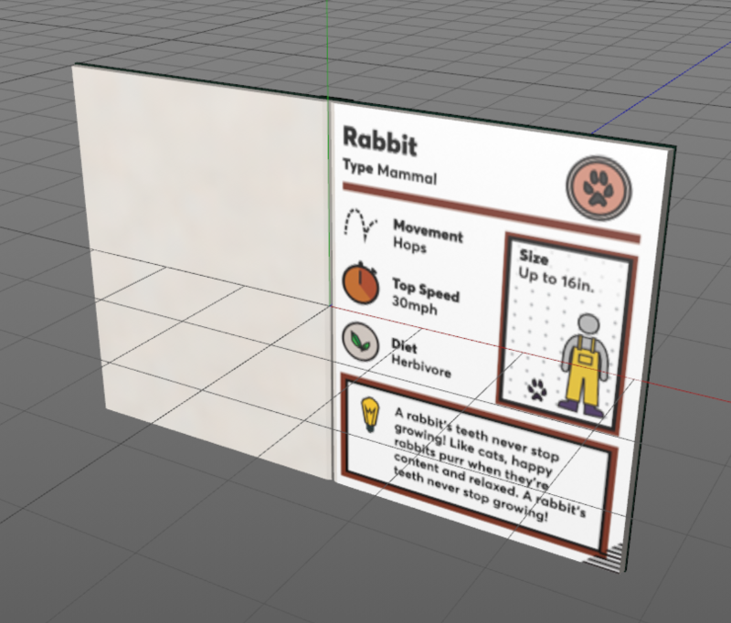
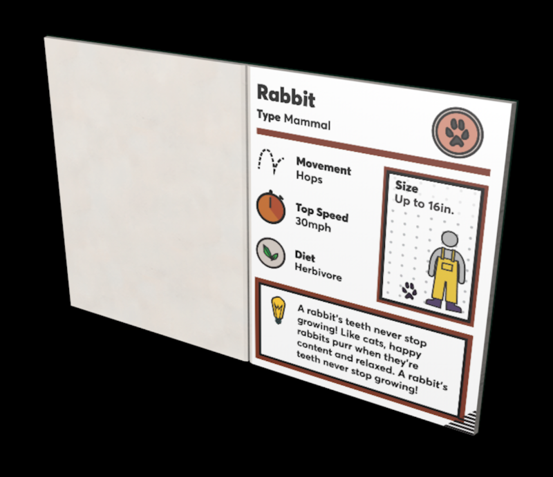
Legibility is essential for design composition. Being in VR can somewhat be disorientating, so registering a 2D design takes a little more brainpower. As a designer, it is my goal to keep the design as simple and legible as possible. These are some points I have learned in the process of inputting 2D elements into a VR space.
LESSONS LEARNED:
The larger the font, the easier it is for more people to read.
Everyone has a different capacity of eyesight, but it is best to design with the criteria that most will have trouble seeing text in the headset. This means exaggerating the size of the text in a composition. Although it may appear text on a 2D plane will be close to a 150% zoom, in VR, it will appear a quarter of that.
Go bold or go home.
The bolder font doesn’t necessarily mean make all the font-weight black. It means the thicker the line weight, the more legible and less aliasing in VR. Thin-weighted font can appear to alias if not directly in the viewer’s point of view.
Understand the headsets DPI.
Some headsets have a higher pixel count than others, so this means more detail can be perceived. The human eye can only discern to a certain amount, so anything higher in resolution will just be a waste of space.
The simpler the easier to digest.
Of course, the design’s complexity varies depending on the context, but less text, in general, is always a user-friendly option. Reading in VR could get dizzying. Probably better to leave complex material out of the headset.
Testing is your new middle name.
Testing is essential for delivering VR ready 2D assets. The elements will look fundamentally different on your 2D screen than they look in VR.
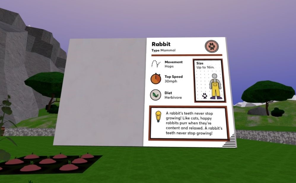
As you are creating 2D assets for a VR experience, keep these guidelines in mind. They are not meant to be roadblocks but tools to use to make the design translate as intended from your 2D plane to a 6DoF world.
DESIGNING IN 3D FOR VR
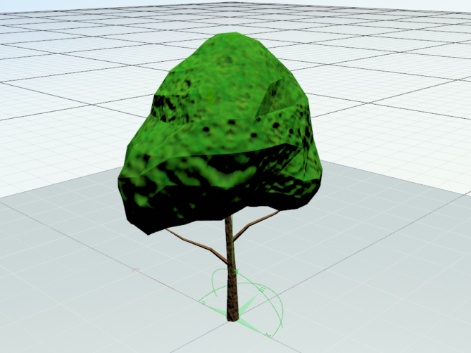
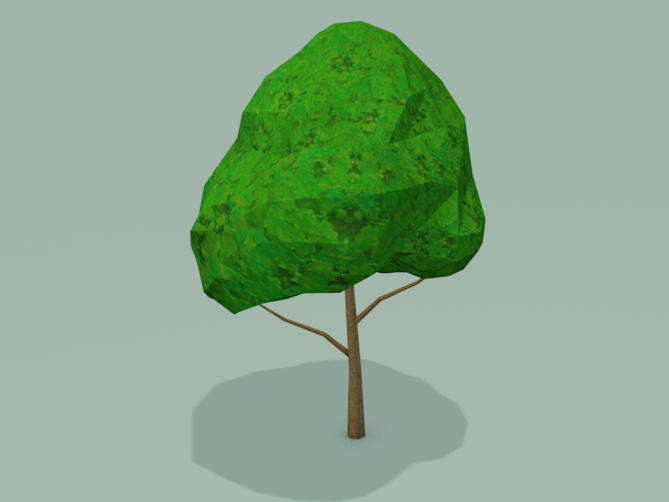
This is a medium that involves total immersion. The viewer is immersed in an alternate reality, which can sometimes have ties to the physical natural world. Therefore, industrial design is a major part of developing 3D assets for VR. These are some points I have learned in the process of inputting 3D elements into a VR space.
LESSONS LEARNED:
Understanding the physical will inform the virtual.
In some cases, 3D design for VR is closer to industrial design than the typical 3D art. Of course, it all depends on the intention and the amount of interactivity the player will have with the 3D object. If an object will interact majorly, it is essential to design with the physics at the forefront. For example, if you understand how a doorknob works in real life, you can use that perception from your experience to make a usable 3D doorknob for VR. Some 3D assets are not interactable, so that the appearance will drive the design more than the usability. This could include background/scene setup, which is mainly there to stage an environment.
Look at it from all angles.
Yes, look at it from all angles. ALL of them. This object could exist in 6 degrees of freedom. That means if it exists in the natural world, it is important to look at the 3D object from every angle.
Just because it needs to look 3D doesn’t mean it has to be 3D.
This may be the case for other mediums, but it is also the case for VR. Easier to take advantage of the eye with 3D. You can register objects from far away as dimensional objects in the right setup that were 2D objects. In VR, you may or may not see 3D assets at all angles, especially objects farther away. This can be an optimization opportunity.
Scale it accordingly.
It may seem like a simple parameter, but it is essential. You can always rely on the 3D software’s scale setup, but sometimes there is a grey area of whether something feels sized “right” in VR.
Testing must be brought up twice.
Just like with 2D assets, viewing your creations in VR will be the only opportunity to understand how it fully translates.
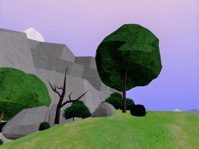
3D design is a great tool to use to set up an environment for an immersive experience. Like with the 2D guidelines, these can be seen more to enhance your composition, not to roadblock it.
IMPORTANCE OF DESIGN WITHIN VR
The art and physics of an immersive experience go hand in hand. Design assets that follow real-world conventions should be designed to follow real-world physics. And real-world physics programmed in VR can be made to be believable with masterfully designed interactable objects.
Although it is important to have parameters when establishing a creative direction, I have learned they should not be used as barriers. VR is an evolving tool, so there are always workarounds or solutions. Sometimes your tests will not always match your initial intention. So, it’s ok to be fluid with your design approach and direction if it fulfills the experience’s outcome. The art of the experience will give the illusion of its believability. 2D/3D art design is an essential part of the VR development process.

