HYGGE IT OUT: THE LOOK OF LOAM

Written by Shelby Vecchio
The look of Loam was cultivated by our team entirely remotely. We started putting together Loam a little after the pandemic hit. Our first brainstorming sessions were over Zoom, which set the precedence for how the creation of this game would go. Developing the art direction of the game was no exception.


A lot of solo work had to be done since we were all quarantined for almost all of 2020. A lot of research and discovery had to be done on paper, video calls, digital presentations, and virtual demos. For a Virtual Reality (VR) game, this seemed possible as we were able to come up with a system to all be able to test and work together remotely.
Loam began with an idea, some goals for the intention of the game, and a loosely defined genre. We knew it would mainly focus on gardening outdoors, be a peaceful escape, with little conflicts in gameplay. As the story started to evolve into what we know as Loam, the intention of the game became clearer. Some themes became apparent for the visual direction:
– Tranquility
– Simplicity
– Isolation
– Visually dynamic
– Natural
– Tactile
– Task orientated
Background of the Art Style
After establishing the setup and themes for Loam, the research began on places on Earth we could emulate in VR. Setting up the scene would help inform what aspects needed to be addressed and the importance of the environmental assets in order to set up the context of the world.
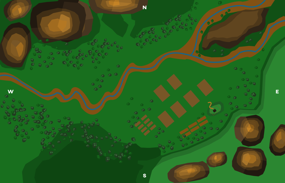
Prioritizing the themes of tranquility, visually dynamic, and isolation: we defined the environment to be set in a mountainous valley landscape. It was inspired by Nordic European mountain valleys, all while taking pieces of inspiration from the American West and Mediterranean mountainous landscapes.
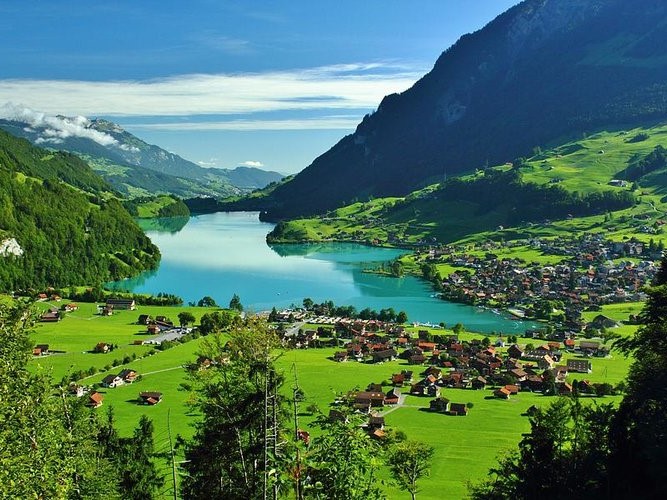

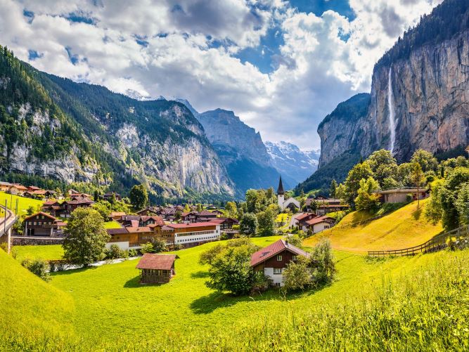

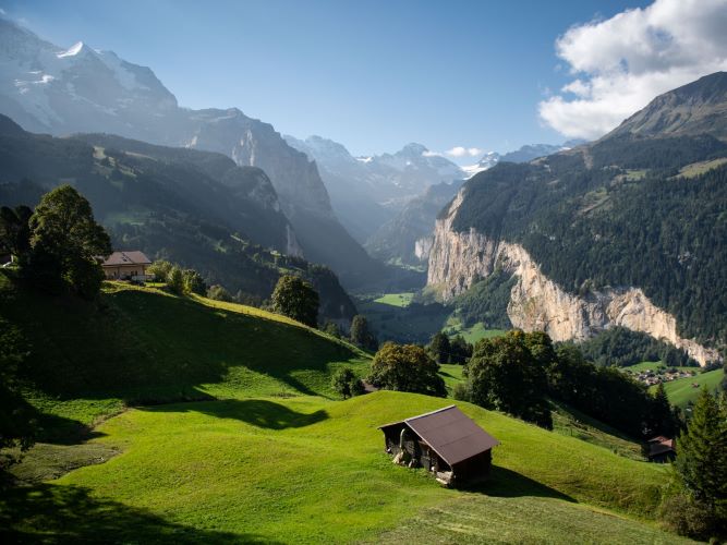

Knowing the game’s setting, we knew that objects had to be created in a wide range of scale. So whatever treatment worked for a tool should be applicable to a mountain. The game would contain a large volume of items, so I wanted to keep a consistent visual language since we were dealing with a ton of assets. The more definitive the look, the less we could contemplate the treatment of the design for each item or effect.
From these themes, the tone of the art style was loosely defined:
Bright, cheery, cozy within the valley, yet vast in the distance, hopeful and optimistic.
Asset Structure
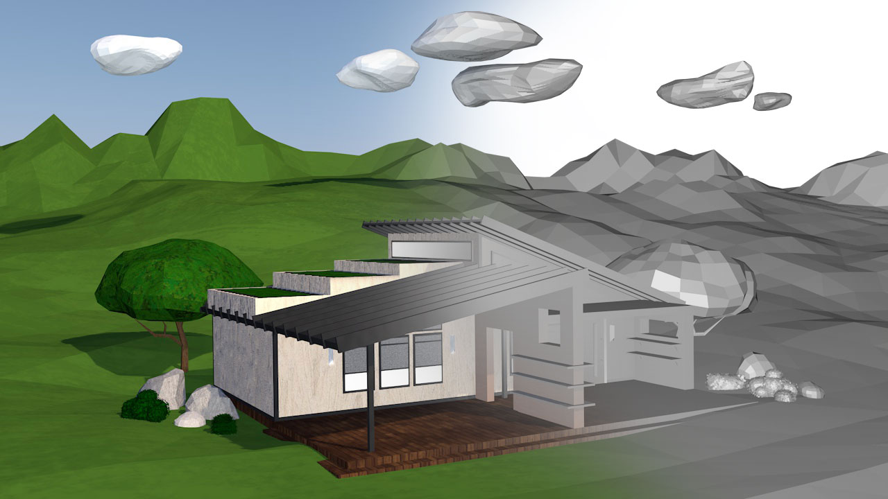
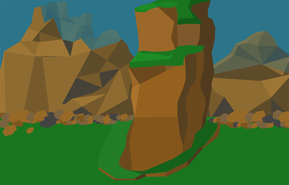
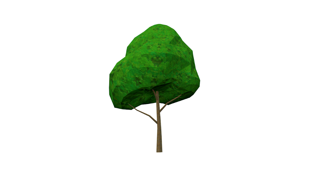
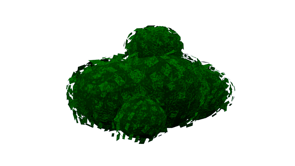
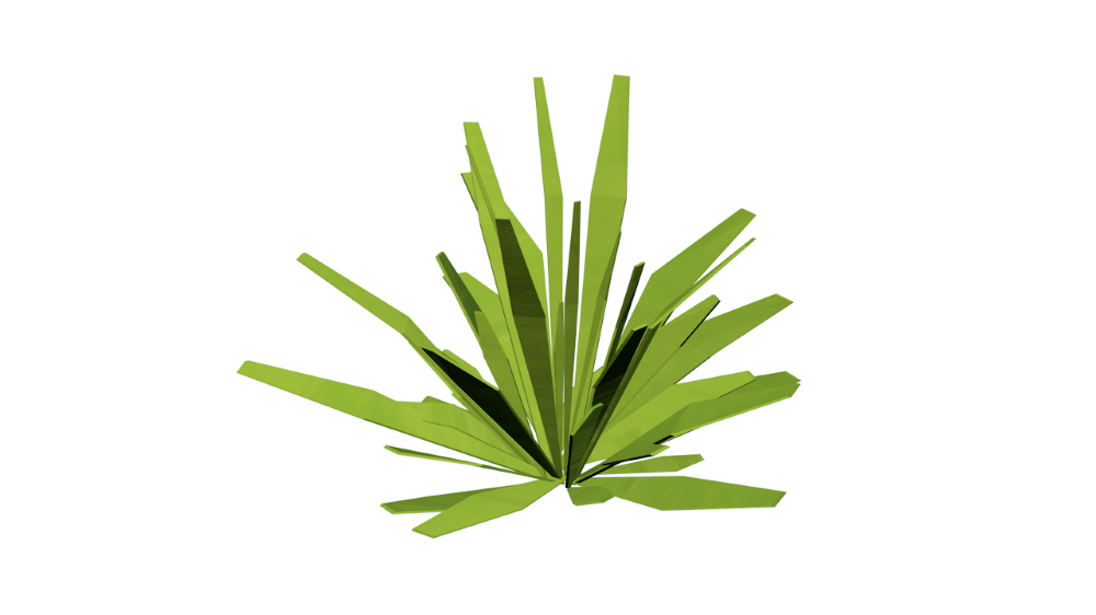
As I dug into different model looks, with the curated guideline above, low poly seemed like a smart move. Not only does it save computing power, but it would give us a little more freedom in transforming real-world elements into a virtual space since we do not have to conform to realism. When you picture “low poly,” the mind tends to wander to those beautiful sharp triangular shapes you can find when executed well in many games and renderings. But with Loam, we wanted to push the continuity even further and try something a little different.
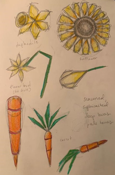

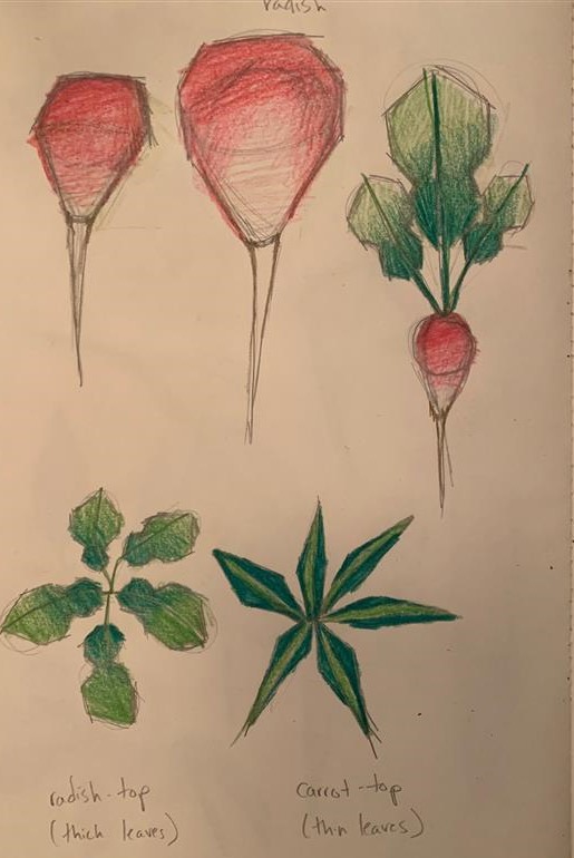

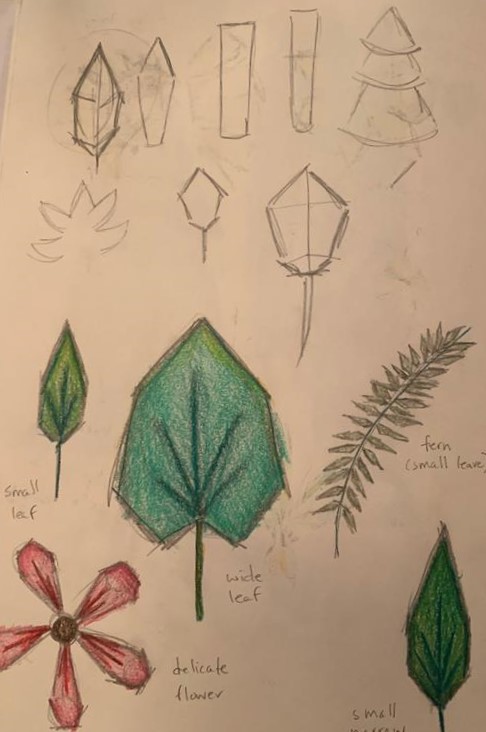

The objective of the style was to create a peaceful and tranquil set up, so as you are playing the game, the visuals would not cause a sense of overwhelm but a sense of calm. This was accomplished by using a visual of a quilt, which in the physical world has a connotation of warmth and comfort, as the structure of all the elements you will see in the game. There may be some sharp angles for context, but overall, everything should be following a sense of “blanket” in shape. Hence why you will only see mainly quads within the game.
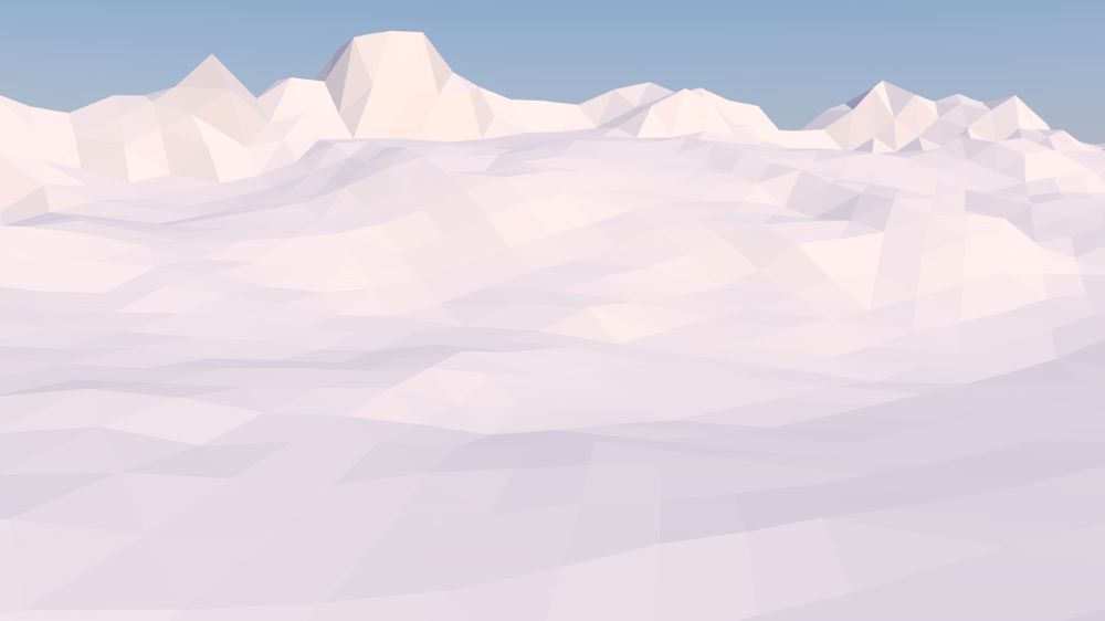

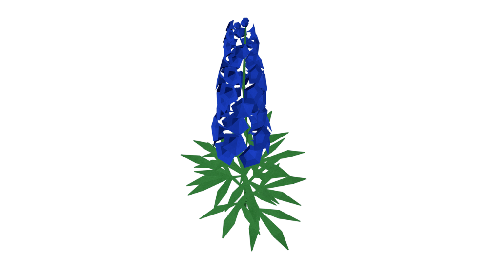

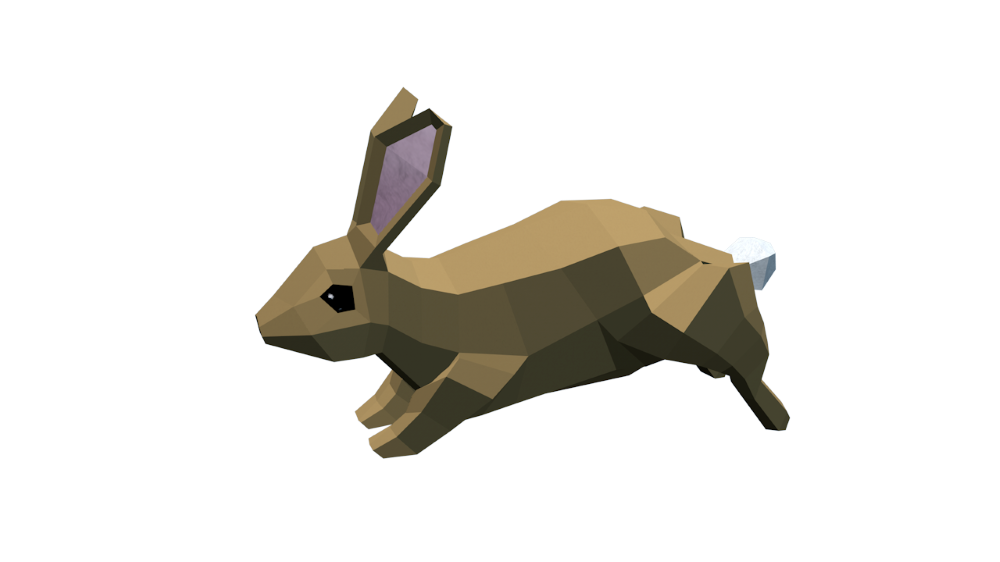

Understanding the scope of the environment means I set up a custom landscape from physical world inspiration and had to design the tools and items the user would be interacting with. Since I was digging into industrial design and a little bit of architectural design, I began research with the setting in which it was inspired, northern European. With its popularity, it was easy to find and understand the appeal: Scandinavian design.
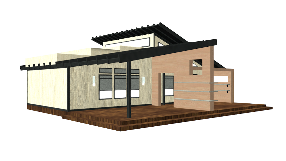

This further informed the structure of tools. Minimal in detail, highly geometric, and aesthetically contemporary. We also sourced inspiration from midcentury modern machines and household appliances. The mid-century look is very thoughtful in aesthetics, bold in shape and texture choices. Many items designed in this aesthetic have tactile, chunky operating systems, which complements the mechanics in a VR immersive experience. The more intentional the buttons and interactables, the faster the player can learn how to work a tool in VR. Midcentury modern also compliments the Scandinavian design quite nicely as they share some of the same design practices.
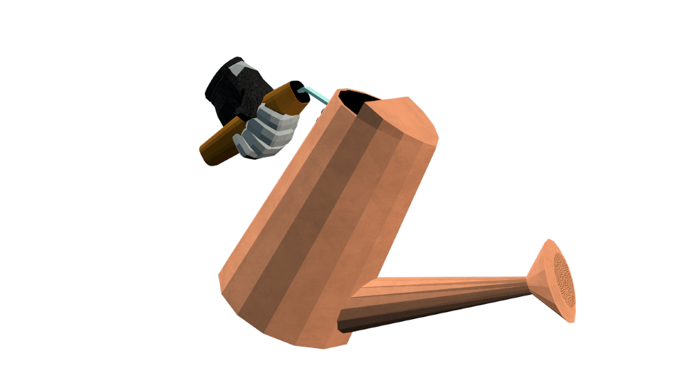

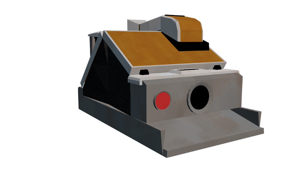

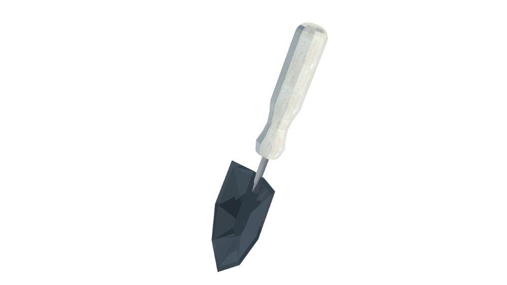

Having dug into the Nordic and Scandinavian design, another term kept popping up. It was something I was aware of but never had the language to define. It was a popular trend a few years ago, but you could say boutique home good stores have it still going strong today. The term seemed to fit effortlessly, so I added it as a main theme to the design language of Loam:
hyg·ge (noun) /ˈh(y)o͞oɡə,ˈho͝oɡə/
Merriam-Webster defines hygge as “a cozy quality that makes a person feel content and comfortable.”
Using hygge as guidance this ties in with the Nordic environment inspiration and the quilt aesthetic. This kind of design relies on natural materials, which fits within the context of the game. The player resides in a mountain valley, isolated from the outside world. This means they would only have their hands on the materials around them.
Digging a Little Deeper
Textures
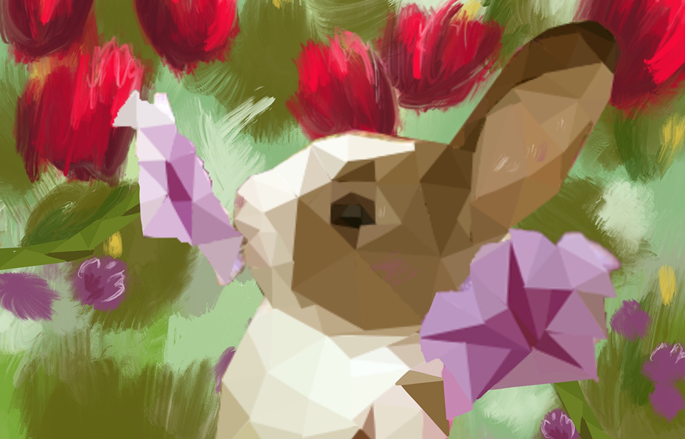
Due to the context of the game, we knew most of the art would be influenced by the physical and natural world. Although it could be said the natural world contains a lot of symmetry, it also includes a lot of chaos and fluidity. It made sense for us to create custom textures. No templates, no structure, just organic patterns. Almost all the textures within the game are digitally painted.
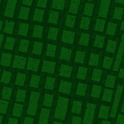

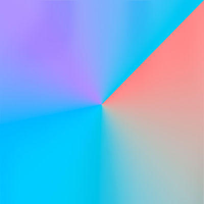

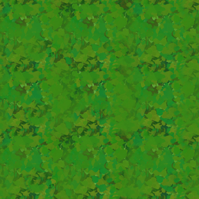

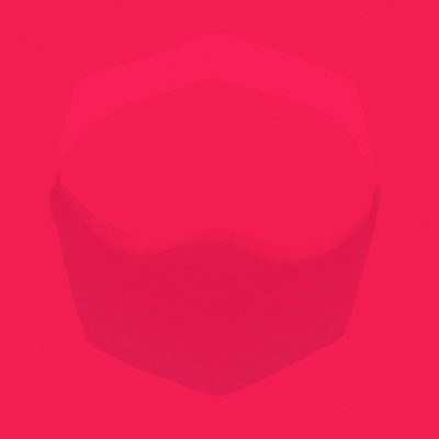

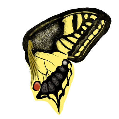

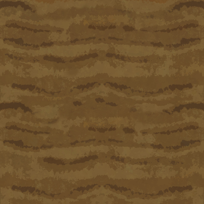

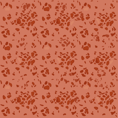

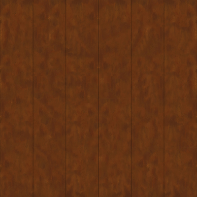

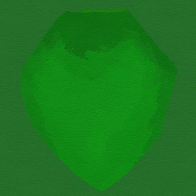

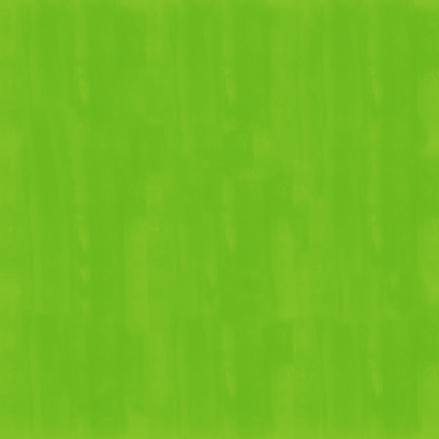



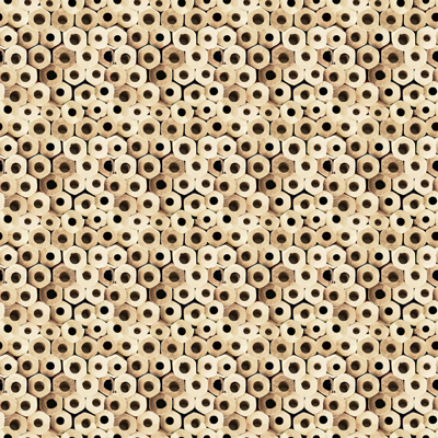

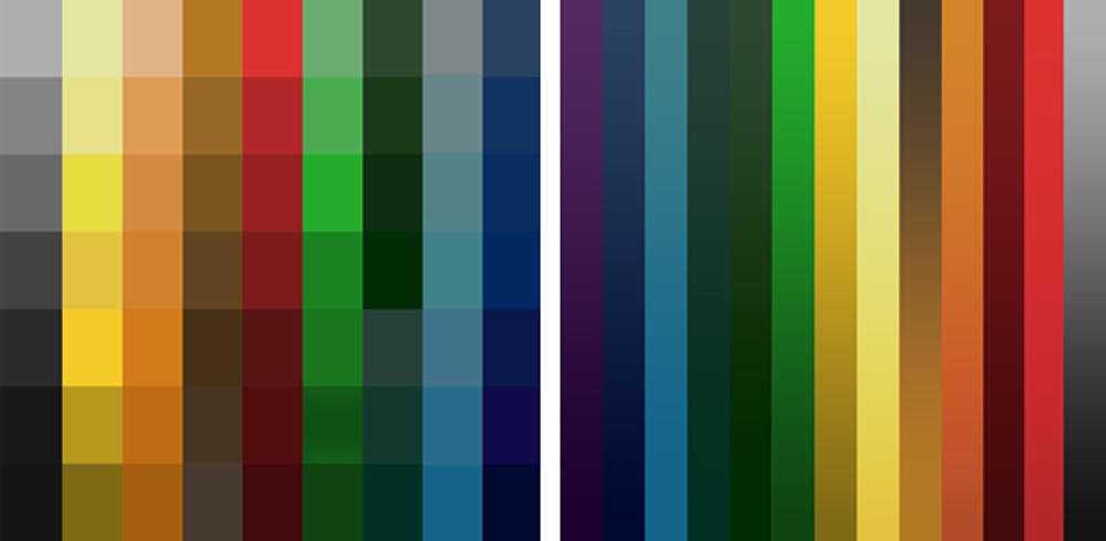
We worked with a digital illustrator who cultivated each texture for the entire environment. Following a natural pallet, rich in color tone but subtle in the usage, our texturing had a direction. Natural, raw materials, and jewel tones. Lighter building materials and vibrant plants.

Lighting
One of the main objectives of Loam is to create your own garden however you see fit. We looked to our physical world again for inspiration. Light is essential for gardening in the real world, of course, depending on the plant for how much light is necessary. This establishes the importance of light. Using the vibrant color tone parameter, there are four distinct points of the day with their own color gradient. The sky follows this color pattern for each point of the day, and the coloring of the elements adjust accordingly. Shadows can be seen like real-world occlusions that would happen with their surroundings.
Effects
There is no exception to this aspect of the environment. Keeping the consistent art language means there is a sense of quads to effects while maintaining the roughness of the textures when applicable. We are still in development for these effects, so stay tuned to see them in Loam!






Hygge it Out
Now the art direction was really shaping up. It evolved into the following visual language:
Following the tone of a hygge sense of environment, loosely based on Scandinavian industrial design, minimal geometry, rustic and natural textures, all with low poly quadratic skins.
We concluded to follow these general guidelines as we set up the environment.
- Season motive: Spring/Summer, flowers in bloom, trees filled out.
- Design motives: Sophisticated, seasoned, soft cubism, detailed/tactile textures.
- Color motives: Deep hues, low/high saturation.
- General setting elements: Set within mountain valley, dense forests in the background, plain forests.
I hope you get to enjoy the world of Loam as we planted the seeds to cultivate something beautiful!
Art Team:
Art Director – Shelby Vecchio
Modeler/Tech Art – David Macias
Digital Illustrator – Shelby Brown


